Thursday, 26 March 2015


10 Job Roles Conclusion


I had options to look at newspaper and TV adverts of companies and workplaces, also via online through different kinds of websites that list jobs linked to or specialise in media, art and design throughout the research of 10 different job roles. Though I also had people recommend job roles that they know about or any other websites. I mainly looked for the job roles on two websites;

  • National Careers Service
  • Prospects


National Careers Service had a large list of different kinds of jobs, though not all of them were clear why they were linked to Art, Media and Design.

The made a list of 10 jobs that interested me the most and be a job role that I would enjoy to have:

  • Animation
  • Graphic Design
  • Art Editor
  • Photographer
  • Illustrator
  • Tattooist
  • Make-up Artist
  • Production Designer
  • Design Engineer
  • Costume Designer


I learnt that almost all of these job roles require expierience and qualifications, though the qualifications don't have to be A* if you have a strong portfolio, reliable skills and work experience linked to the job role.
The most wanted and preferred skills for most job roles include being a quick and concentrated worker so deadlines are to be reached within the preferred time, understand different software's and computers/devices that are supplied, having an imagination to think up new ideas, artistic skills etc.

The information I gathered by researching the job roles helped me understand and prepare for future employment in a workspace independently or in teams. Building up a portfolio of my work and qualifications with a plan of how I would present it if I was asked to. Self-employment is also an option since it's recently became very popular and easier to understand and do, people doing commissions of their art, designs etc. for people online for a fee, the amount depending what their client/commissioner asks for.


Monday, 23 March 2015


Bruce Lacey


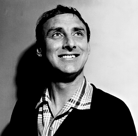
Bruce Lacey was born in 1927, he's a British artist, eccentric and performer.
He had been in the Navy before being known as an artist, completing the national service which was where he practiced some of his performance and knowledge of art and mechanical constructs.
He studied at Hornsey College of Art from 1948 then at the Royal College of Art in the early 1950's, in the 1960's and 1970's he visited a professor at art colleges from St lves to Leeds.
Bruce Lacey contributed to an exhibition in 1968 called Cybernetic Serendipity directed by Jasia Reichardt, a British curator, art critic and writer, Lacey exhibited some of his creations.
Bruce Lacey has made props for movies and shows such as 'It's a Square World' as well as haven had an act in Richard Lester's, an American film directer, 'The Running Jumping and Standing Still Film' that is a short and just eleven minutes long that was created over two sundays in November 1959 with the budget of £70. He's been featured in comedy shorts and feature films like 'Uncles Tea Party', Defective Detectives' and 'Smashing Time'
Before researching Bruce Lacey I did not know that the robots he created were like friends to him, one of them being a best man at his wedding.


Spike Milligan


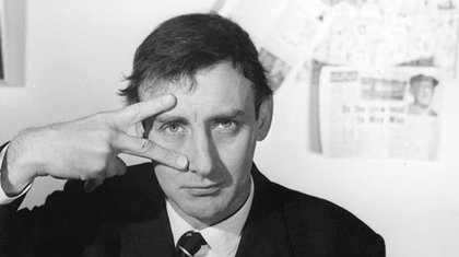
Spike Milligan had an Irish nationality, his real name is Terence Alan Milligan though he disliked his first name and began calling himself "Spike" after hearing a band called 'Spike Jones and the City Slickers'.
Was born on the 16th of April 1918 in Ahmednagar, British India and died on the 27th of February 2002 at the age of 83 in East Sussex, England. The reason he was born and first lived in India was because his father was in the British Indian Army.
Terence was a comedian, musician, actor and a solider in the second world war but was most known for being a playwright, poet and screenwriter.
One of Spike Milligan's poems called "Welcome Home"
 
Welcome Home
 
Unaware of the crime
they stood me in the dock.
 
I was sentenced to life....
without her.
 
Strange trail.
No Judge.
No Jury.
 
I wonder who my visitors will be.
 
 
 His work influenced Monty Python, Robin Williams and many other artists.
 Milligan was the co-creator, principal cast member and main writer of 'The Goon Show' which was a British radio comedy programme. 
 

Thursday, 19 March 2015


T-Shirt Design


As I thought of a design to go on a piece of clothing such as a hoodie or t-shirt I wrote down a short list of names that I would like my design to be named under, a title for it like clothing companies 'Nike', 'Vans' and 'Adidas' does, their logos not really looking like what the name of it is. 

The names I thought I could use were;


  • Molar
  • Collar
  • Bell
  • Busted
  • Orbit
  • Hooked


I thought up what kind of logo and designs I would have on a t-shirt or hoodie, wanting something different and interesting to see while the design not being too big or small when it's on either the front or back that could possibly link with the title, such as using a picture of a molar tooth and manipulating it to look like a letter. I made some quick sketches of my ideas, the sketches actually linking to what I find interesting and would buy myself if I saw it on some clothing, this included a 3D looking model of a bell, quick sketches of a planet that I linked to the look of Jupiter and Saturn, and vampiric teeth.


After getting the sketches and drafts of my design, logo and title I began to develop it on Photoshop and Illustrator.


With the logo I just wanted to keep it a black font, but when I tried it dark coloured tops I realized it didn't stand out as much as I wanted it to, so I had the title/name of the brand have a red fill and black outline when on darker coloured backgrounds.
I developed the mouth of vampiric teeth idea and gave it a white lighting effect, having the design made up of three main colours with different levels of consistency or with a fading effect, black, red and white. I also thought of using a molar tooth as part of the logo, linking it together with the main design. As I continued to develop the idea I thought how I could improve it, I came to the idea of using some kind of pattern around or inside the main design like the 'hype' brand does, this way it would stand out more. I used a large, rounded thin bristle brush on Photoshop and did a large group of scribbles in a circle motion, once I was happy with the pattern I debated if it should go around the teeth design or inside it, though I chose to have it on the inside, giving it the effect that the pattern is on the teeth along with the white shading.


Review

Brand ID


The ideas behind my design and logo idea was it being linked to my own interests of the supernatural, this linking it to vampiric teeth that has a sharp smooth look to them. The smooth, sharp look of the main design inspired me to have the title of the brand linked to it, so I chose the closest font I could find of what I wanted it to be and edited some of the letters to have sharp, pointed edges to them.

Strengths

I believe the strengths overall in my work was in my sketches I used my own ideas linked to my own interests, making a cut down, short list of what names I would possibly use, the main designs and then how I could link them together like 'All Star Converse' does in some of their designs. The developed, cleaner and smoother version of my design really stands out to me as I go back to look at how I started off with a plain design of a mouth of teeth and developing it to have shadowing, lighting effects and design all while using the main concept colours. 

Weaknesses

The weaknesses in my work and what I would improve was the overall development of my ideas since I didn't have a lot of different ideas even when I could've included even more. The other design I was thinking of using, the planet inspired by Saturn and Jupiter mixed together, could've had more final development on it by filling the lines in and trying out the pastel colours I was planning to use on it, though I didn't do this because I was focusing more on my teeth design and logo.

Logo ID


The 'hype' brand looks like it is using a simple signature, hand written technique for the design and logo, adding more elements to it such as a background or frame to stand out and be more eye-catching.

The converse brand uses different colours, frames and font for the different logos they use, but always use a star in them since the brand has became well known and popular that the use of a star would have people think of the brand 'Converse'.

Wednesday, 18 March 2015


Laurel and Hardy


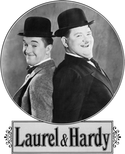
Laurel and Hardy was a slapstick comedy double act during the silent film era, made up of Oliver Oliver Hardy, a heavyset American and Stan Laurel, a thin Englishman. They were most popular during the late 1920's through to the mid 1940's.


Stan Laurel was born in Lancashire on the 16th of June, 1890 and died on the 23rd of February, 1965 in California due to a heart attack.

Stan was an English comic actor, director and writer along with his famous duo with Oliver Hardy. He was a member of "Fred Karno's Army" which was referred to as a chaotic group or organisation, and where he was Charlie Chaplin's understudy. His career in silent films and sounds films went throughout 1917 and 1951, appearing in over 50 films, mostly taking strong roles even though most producers found it difficult to give him one, seeing him as either a Charlie Chaplin imitator or 'nutter burglar'.
Before teaming up with Oliver Hardy he teamed up with Mae Dahlberg, an Australian music hall, actress and vaudeville performer, they lived together under common law and husband and law, though 'dressing room arguments' between the two were common and Mae was even paid by the producer Joe Rock to return to her native home in Australia.


Oliver Hardy was born in Harlem, Georgia on the 18th of January, 1892 and died on the 7th of August, 1957.


Monday, 16 March 2015

Harold Lloyd


Harold Lloyd was born on the 20th of April 1893 in Nebraska, United States and died on the 8th of March 1971 in California.
He was an American actor, director, producer, screenwriter, comedian and did many incredibly life threatening stunts in silent comedy films during the silent film era and ranked alongside Buster Keaton and Charlie Chaplin, being the most popular film comedians.

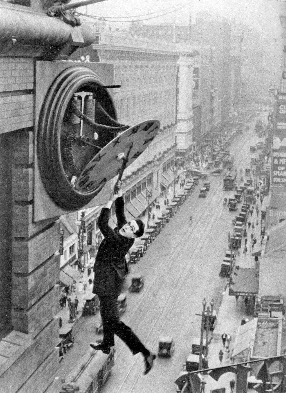
One of Harold Lloyd's most famous scenes was in the movie "Safety Last!" where he was hanging from a clock face and it's hand danling from a skyscraper, it was preformed in public with no special effects, stunt doubles or safety lines, being one of the most dangerous yet successful stunts preformed in public.


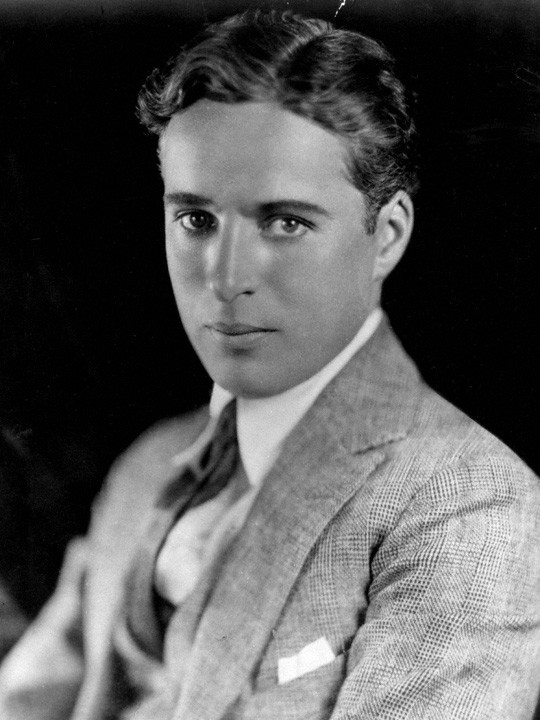
Charlie Chaplin


Charlie Chaplin was born on the 16th of April 1889 in London and died on the 25th of December 1977 in Vaud, Switzerland.
He was a famous silent film actor, doing extremely dangerous stunts and making loud looking movements and body language and became a worldwide icon for his silent film appearances and productions.
His early career started when he was just five years old by preforming on stage between spending time at the poor schools and his moms mental illness, though at the age of nine his mother encouraged him to continue preforming.
He was supposedly kicked out of America as he was thought to be a communist and didn't accept to have an American citizenship

Surrealist writers and Charlie Chaplin

Interactive Media

For interactive media I am testing DVD menus/titles, observing text that was used, music, images, sound effects, selection of scenes, what kind of special effects that are used just in the title, does the text glow or light up when selecting it etc.

Gladiator 
Disk 1
The intro has short clips and glimpses from scenes of the movie put together as it leads into the title screen.
The music on the title screen sounds like an orchestra playing and lasts for 34 seconds before repeating, sounding like it had been cut out from a longer song with the same roman theme as the movie.
The scene selections are numbered in roman letters to fit in with the theme of the movie being during roman times. The scenes from the selection also have motion to them, being short silent clips in the boxes from the movie.
The colour of the title screens have a bright contrast of mainly faded pink, white, faded yellow and some brown along with black silhouettes of mountains and figures and to make shadows.
The main image of the title screen is overall still, not having any motion apart from the fading in and out faces of characters from the movie around the clouds of the titles background.
The text that is listed at the bottom of title screen has white roman looking font, and when selecting one of the listed texts or hovering a mouse over they highlight up with a lighter faded box around the text. Each box of text leads to another page of options of subtitles, scene selections, subtitles or to just start the movie.

Disk 2: Special Features
The music that is playing over the title has a  lasts 30 seconds before repeating. It sounds like it has been cut out of a longer song with a roman theme too.
Both pages of the title has a background with brown/discolouring filter over a still cropped image, the first one being the outside of an arena, the second being mountains and ruins. Though the free space around the arena image has a moving image of real clouds with a sped up effect so it catches the viewers eye.
The text that is listed to the right side of the title screen with white roman looking font, and when selecting one of the listed texts or hovering a mouse over they highlight up with a lighter faded box around the text. Each box of text leads to another page of options of more text or to a clip linked to the movie.

Monday, 9 March 2015

Buster Keaton

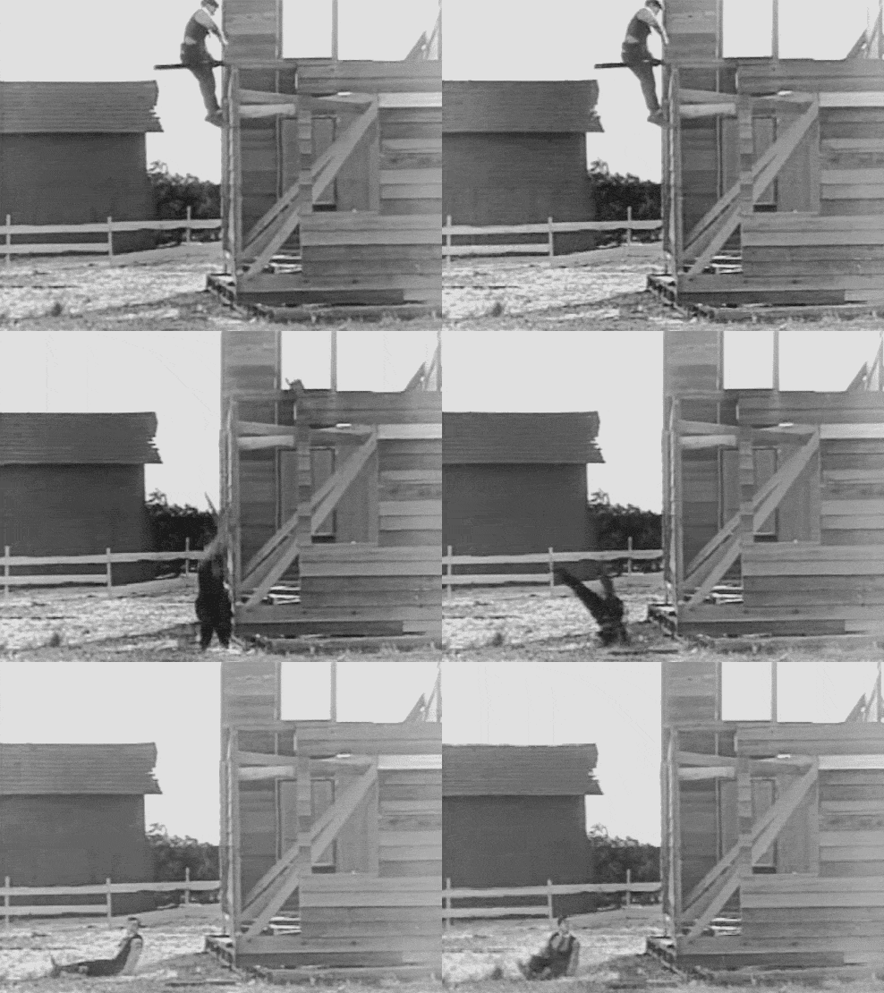
His full name was Joseph Frank Buster Keaton who was born on the 4th of October 1895 who was born in Piqua, Kansas and died on the 1st of February 1966 in Los Angeles, California of lung cancer.

He was known for being an actor, filmmaker, writer, stunt performer and vaudeville which is a theatrical genre of entertainment, like musicals. He got a lot of exposure in his silent films since he had a physical comedy with stoic with a deadpan expression which gave him the nickname "The Great Stone Face" and making it his trademark.
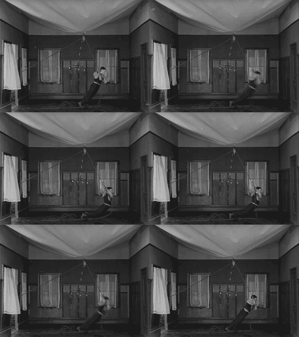
Surrealism in Buster Keaton's "One Week":
  • Poetry
  • Jumping out of cars
  • Assaulting the law (police)
  • Building house by himself from supplied boxes with paper instructions
  • Logic used
  • Getting up/durable from taking high falls
  • Gravity, Weather
  • Unnatural strength, Balance
  • The dangers included that he faces and avoids
  • Strange changing furniture, properties/materials and architecture of the house and the use of some of them 
  • Unreal situations mixed with everyday situations or making them overdramatic
  • Censorship
  • Misuse of objects/Use of objects
  • Tricking the viewers perspective and view


Monday, 2 March 2015

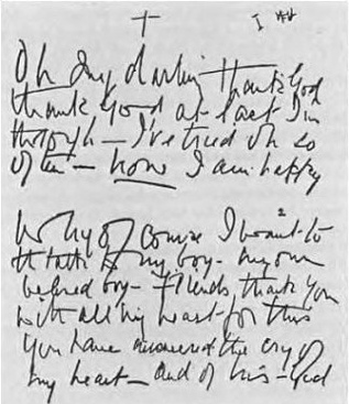
Automatic Writing Story

Having clouds as chairs and chickens as plates
The kitchen would be hell and the bedroom would be a forest
Old cracked bones being the new trend
Walking past mothers as trees
Flickering lights of an old computer through a shredded red leaf
The keyboard being the knife and fork with a mouse as a dessert spoon
Landscapes and mountains looking like reflecting shards of glass, making new colours
Frozen bones being cracked sticks
Running off a field called October
Windows looking like doorways
Veins bringing life to a river that kick starts sounds
Three linked rings on a wooden door
Jumping to vibrations in an atmosphere
Over and under a brick bridge
Through the next exit that's being shown.

Throughout over the most of the writing I had been listening to Bones by Dustin Tebbutt that was on repeat. It defiantly helped me get into an automatic writing state with Halfway through the automatic story I referenced "frozen bones" which was included in the song as a main chorus, also "mountains looking like reflecting shards of glass" referencing to the over that was showing on my phone as it played.


Listening to music while doing automatic writing and drawing can defiantly effect the work that's being created; Relaxing music could effect the writing to have deep meanings or including pretty and comforting words, drawings having thing smooth lines with bright and light colours. Loud and heavy music effecting the writing to be dark, more scrambled and dark, drawings having thick, rushed, rough lines with dark, dull and rough looking colours.
Automatic Art / Animation

Surrealist Automatism

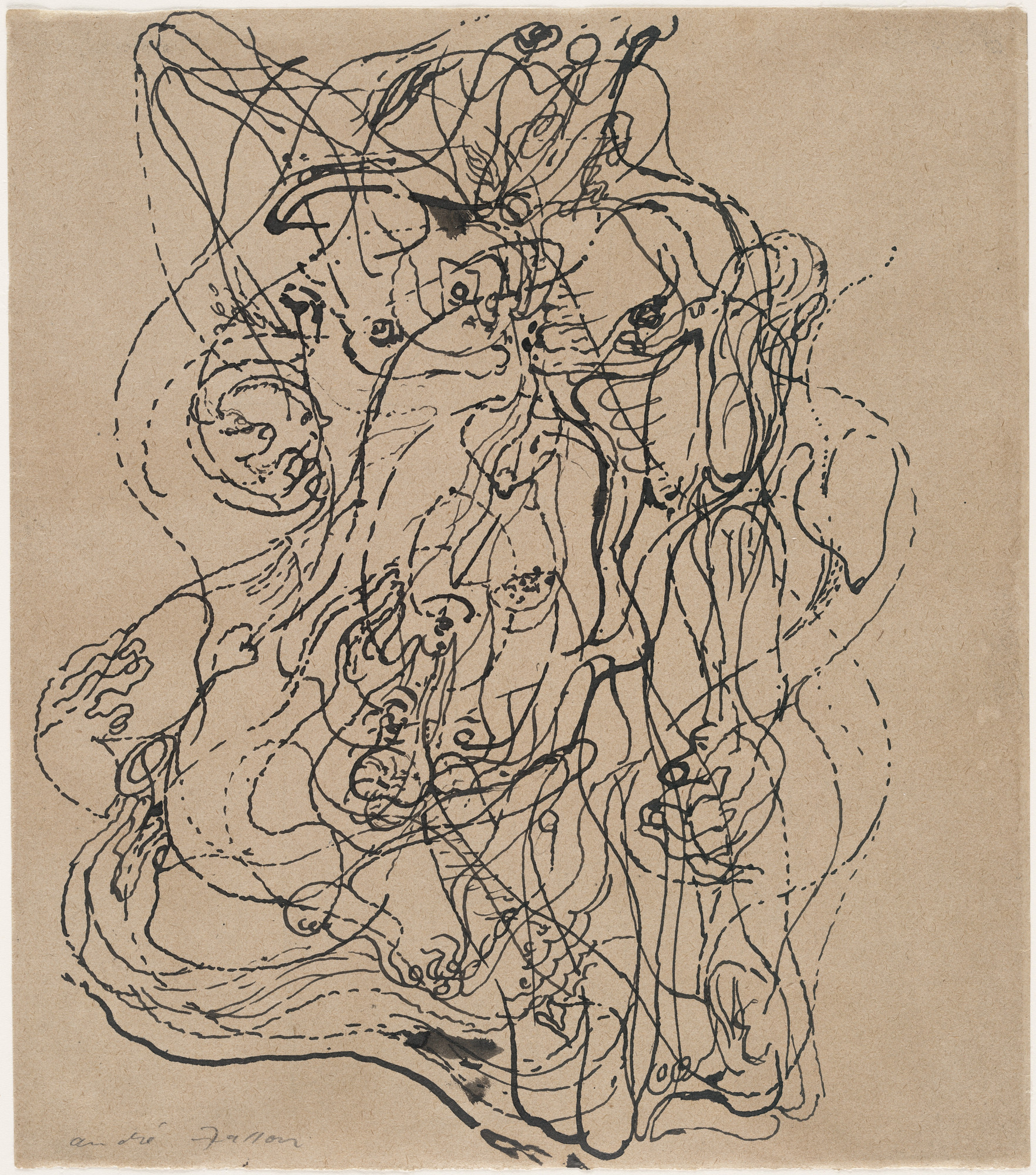
Automatism has taken on forms in automatic writing and drawing that was practiced by surrealists, automatic art still goes on to this day.
Surrealist automatism is different from Mediumistic automatism, which is a practice of mediums that meditate communication between spirits of the dead and living human beings.
Automatic drawing can be done by painting or drawing on paper without lifting the brush, pen or pencil off from the paper.
Some Romanian surrealists invented a few surrealist techniques that took automatism to what was seen as an absurd point, giving it the name Surautomatism, implying that the methods go beyond automatism.


Joan Miro

Joan Miro was a Spanish painter, ceramicist and sculptor born on the 20th of April 1893 and died on the 25th of December 1983 at the age of 90. His work is categorized as surrealism ans seen to be "a sandbox for a subconscious mind and being child like". When Miro was interviewed about his work he expressed that his painting methods was a way of supporting the bourgeoisie society and declared the "assassination of painting" in favor of upsetting the visual elements of established painting in his lifetime.
Growing up in Spain during the wars meant fascism was something him, his family and community was in had to deal with

In a Joan Miro video his studio and places where he painted are shown, along with the paint marks and splatters of where he had his canvases in his studios. Miro was said to have been always working with his paintings, painting at age 11 to his 80's since he believed he should keep working and create as much as he could before he was too old, this being said when he was 80.