Sunday, 18 October 2015
Figure Drawing
In figure drawing I was encouraged to draw with a stick with charcoal taped to the end again with the paper on the floor, this time using different colours, so I do understand why my drawings came out a bit uneven and strange, though I know there could be a lot of room for improvement, I'm kinda happy they turned out better then I thought they would.
On my last drawing I used charcoal and chalk, both taped to either end of the stick I was using, using the chalk for the highlights of the model.
Cabin and mountains project
For the project I was giving a photograph, that was in black and white, of a landscape with cabins, a river, trees, a forest and mountains which I then had to work from, try and replicate it in my own drawing using calk and charcoal and also smudging certain parts to make a better effect for it.
Once I had completed mt chalk and charcoal drawing of the photograph I began making it again but this time using paint.
Overall I am a lot more happy and confident with my chalk and charcoal drawing then my painting since I don't think I used the right colours and didn't think as much about the colour throw, though I'm not unhappy with it, just not as confident with it as I am with my first one.
Once I had completed mt chalk and charcoal drawing of the photograph I began making it again but this time using paint.
Overall I am a lot more happy and confident with my chalk and charcoal drawing then my painting since I don't think I used the right colours and didn't think as much about the colour throw, though I'm not unhappy with it, just not as confident with it as I am with my first one.
Wire and mod rock sculptures
My first attempt of trying to replicate the vertebrae was by using separate pieces of wire to shape it, a thin wire, though overall it turned out to be okay but not as good as it could be, though I still put mod rock over it and then it took a better shape and looked more like a vertebrae.


My second attempt at the vertebrae was more messy but took a better shape while also looking a little more abstract and interesting then the previous one, though I decided not to put mod rock over this one and used it more as a reference.
My third attempt with the wire was to try and slightly replicate what seems to be a shin bone. I used a thick wire for the middle and main part of the bone, then a medium wire going over the thicker wire and to make the bone ends shape which I secured together with thin wire.
Once confident with my wire structure I put mod rock over it which is when it took even better shape of a bone though still looked a bit abstract compared to the original model of it.


My second attempt at the vertebrae was more messy but took a better shape while also looking a little more abstract and interesting then the previous one, though I decided not to put mod rock over this one and used it more as a reference.
My third attempt with the wire was to try and slightly replicate what seems to be a shin bone. I used a thick wire for the middle and main part of the bone, then a medium wire going over the thicker wire and to make the bone ends shape which I secured together with thin wire.
Once confident with my wire structure I put mod rock over it which is when it took even better shape of a bone though still looked a bit abstract compared to the original model of it.
Chalk practice with skeletons
I used chalk and charcoal with these drawings, encouraged to use the technique of focusing and drawing around the negative space of the skeletons that were posed in front of me.
On the black paper I first drew the side of the ribs and spine of the skeleton with just chalk, the second time I drew the top of the spine and shoulders of the skeleton which didn't have the skull on top of it, this time using both calk and charcoal.
On the white paper the skeleton had some cloth draped over the top of it with an apron also tied around it, this time I only used charcoal.
On the black paper I first drew the side of the ribs and spine of the skeleton with just chalk, the second time I drew the top of the spine and shoulders of the skeleton which didn't have the skull on top of it, this time using both calk and charcoal.
On the white paper the skeleton had some cloth draped over the top of it with an apron also tied around it, this time I only used charcoal.
Life Drawing with skeletons with charcoal
I drew multiple poses of a skeleton dressed in some clothing (a work coat and hat) with chalk to practice my skills on drawing the figure, but of course this time without having much shape to it like a normal body would, though the clothing helped take a slight shape as if it did have some property to it.
Each drawing had a different technique to it, one having been using quick and messy strokes of charcoal, one focusing on the negative space, some attempts of drawing the whole skeleton in my view, others only part of it etc.
I overall do feel comfortable and a little confident with how to use charcoal and how the drawings turned out, despite being challenged to try these different techniques, some I haven't used before.
Each drawing had a different technique to it, one having been using quick and messy strokes of charcoal, one focusing on the negative space, some attempts of drawing the whole skeleton in my view, others only part of it etc.
I overall do feel comfortable and a little confident with how to use charcoal and how the drawings turned out, despite being challenged to try these different techniques, some I haven't used before.
Stick Drawings
To practice for life and figure drawing I was told to use a long stick with charcoal and coloured chalk taped to either end of the stick i was using to draw instead of using a pencil or the chalk by hand, it would challenge my skills and help develop them more, encouraging me to take more confident strokes and movements with my hand, arm and body when drawing.
Hazard Poster
My idea for my poster was to link it allergic reactions that can happen when using the materials in the studios.
I first did some research of what can cause the allergic reactions within a creative workspace, this included latex, some certain rubbers, dust, wood clippings/shavings, mod rock, food brought in etc. Also researching the safety equipment that can help prevent it including certain cloves, make, safety glasses, work coats etc.
Once getting my research down, writing and drawing some ideas in my sketchbook of what I would like my poster to look like I gathered the available equipment from the studios and took pictures of them. At first I did them on a white background but then I realized equipment that were also white or see-through like the gloves and masks which might not come out too clear when I'm developing them later, so I retook some photographs but in front of a darker background, using black paper.
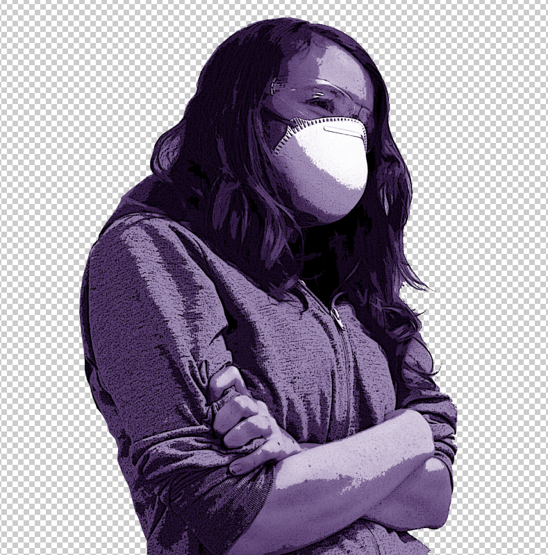
I took pictures of me wearing a mask, safety glasses/goggles and gloves, also some of a skeleton model wearing them that was in the studio.
| I decided to add myself into the poster to show what to wear relating to health and safety when working with equipment and certain materials. |
| I then tried using a darker background, thinking that using a white background when wearing a white/see-through glove wouldn't cut out as easy, so just in case I used a dark background aswell. |
| I used a latex white/see-through glove to use for the safety on a white background to prevent any unwanted colours showing up in the picture. |
I began developing the photographs, cutting them out from their backgrounds, highlighting them, improve their contrast and brightness and all used a poster and paint dab filter on them, making them stand out as I used the effect strongly on them.
Once happy with their effects I began to experiment with different colours on them to use on the poster, mainly the colours red, green and yellow.
Feeling more confident about my developed photographs I put them on a poster template with impact and helvetica font.


Coming to an end in my developing my photographs and design of the poster, I changed the posters background to black and the borderline, font and developed photographs to a bright yellow that helps it pop out and catch peoples attention.
Subscribe to:
Posts (Atom)