For this unit I had to make a poster that's linked and slightly resembles the National Geographic books, so I would have to make the boarder, the text and a picture to out on the cover of it. Though for this unit I had technical difficulty with getting access to my work of the Mac server I use, which had me to start over with making the layout of the National Geographic cover file and some photos I had already added filters and effects to.
 |
| National Geographic books with covers involving face portraits and the text on top of them |
 |
| A National Geographic booklet with a face portraits and other pictures over it |
 |
| A National Geographic cover with a photograph filling up the space of the cover nicely and professionally |
 |
| Another National Geographic cover with a landscape photo on the cover with white text that's visible on it |
I researched examples of National Geographic books, looking at the kind of font that was used along with how big they are and the kind of covers that were used, how portraits were displayed and if I would have to add effects to mine to link to the ones on the Nat Geo books or have something different.
To get a cover for the National Geographic book, me and a classmate grabbed a college camera and a large camera/film light to help give a better look and effect when the photos were being taken. I had quite a few photos of me taken in different poses since I was unsure what I would want for the cover, but also how the photos might turn out. I've narrowed down the photos I used since quite a few of them I didn't like or they didn't turn out well either due to being blurred, when I'm blinking, bad quality, the camera not being focused on the shot etc.
 |
| An original version of one of the main pictures I used |
 |
| A photograph of me making a pose with my hands shaped around my eyes |
 |
| A photograph of me taking a pose where both my hands are across and hiding my face |
 |
| A photograph of my making a pose where one of my hands is across my face |
 |
| A photograph before I was going to flip my hair up into the air |
 |
| One of the original photos I added filters and effects to later |

 |
| One of the photos with a blur and glow effect added, with this photo I was mainly experimenting with the kinds of effects and filters there were |
 |
| The main photo I used with a light, smudge and polterize effect to make it look like a form of pop art |
I first started editing random photos before settling into the 2 main ones, focusing on one and experimenting with the light, shadows, filters, glows, blurs etc. I experimented with it quickly before moving onto the next one since I wanted to see if the other photo would look better with some effects so I won't waste too much time on the first one.
The second main photo seemed to look better with some effects and filters due to the hood casting a shadow and the film/camera light highlighting the parts that weren't cast with a shadow, giving a much better effect and more control with some of the filters.
 |
| With this one I changed the colour palet involved, so I adjusted the photographs overall colours |
 |
| The photo with a desaturizing effect on parts of the photo, this being my face and hair, leaving my coat, hood, top and lips with some colour |
 |
| I used a shadowing effect along with the polterizing effect too, giving a much more different effect than the previous one |
 |
| Another version of the shadow and polterizing effect, this one having stronger range on the photo |
 |
| The shadowed black and white effected version of the photograph on the cover |
 |
| The colour adjusted effected photograph on the cover |
Happy with the different versions with different effects I had done with the main photo, I then moved onto making the layout of the National Geographic book like file in illustrator. I first made the border of the cover with would be about 5mm thick all around, then I moved onto the text of the cover, adjusting the size, font and placement on the cover as requested.
Once the layout was done I added on the filtered photos onto the cover, adjusting the placement of the photo on the cover until I was happy and confident with how they looked
 |
| The shadow and polterized effected photograph on the cover |
With the effected and filtered photographs on the layout, I then decided to change the colours of the covers, changing them to fit with the photograph on the cover, so changing the colours of the border, main background behind the text and photograph and also adding in a small white border on the inside of the outer border, along with changing what the main text and subtext on the cover said.
 |
| The first version of the cover with the text linking to skittles |
 |
| The final version of the colour effected photo, this time the text linking to alternate 'alien' colours |
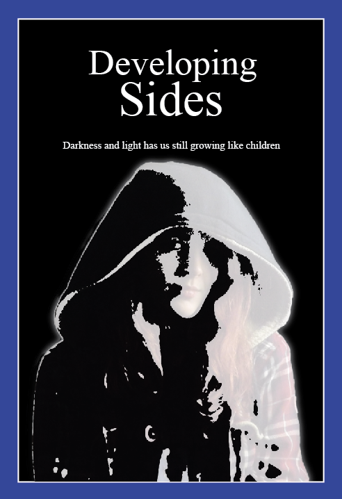 |
| The first version of the black and white filtered effect photograph linking to 'developing sides' in the main title |
 |
| The final version of the black and white photo, having only changed the sub text to about power of darkness and light |

Overall, I'm happy and confident with how they've turned out, though I do think my 'strongest' ones are the polterized and black and white covers, the colour adjusted one looking a bit odd and underdone in my opinion.