Showing posts with label Unit 78. Show all posts

Monday, 18 April 2016

My Comic to NNC

I made some quick sketches of key points that would be
shown in my journey in the comic. This includes the start of
the journey, obstacles I faced, what I went through, my
character development in its style etc.
I began developing my character alot more on a separate sheet
of graphic paper. I developed it a lot in the mouth and eye
designs and expressions, then onto hats. I used my first idea
of the eyes even though I had developed some other options
to use, but I stayed with the 'blank' eyes option.
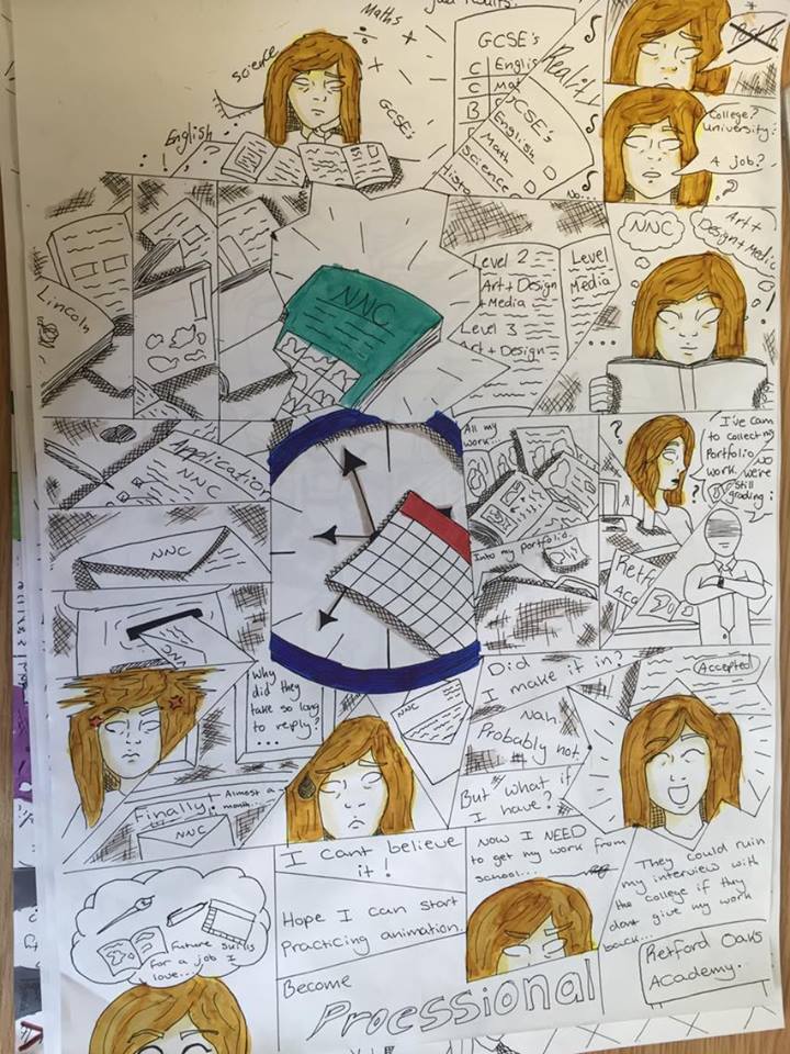
 My comic is based on my journey from school to college, including how I felt, thought and had to overcome during this journey.
Making this comic I had to plan and go through a lot of development of my story and my character. For my story I would have to decide what I would include and not include, with my character it would be the appearance of the character, that was of myself, and what kind of style I drew it in.

I had to make a character, of myself, in my own kind of style that's aswell influenced and inspired by other artists.


When I was developing my character to a near final design, I first began with getting the basics down of mouth expressions, sketching down the different kinds I could think of, then I designed options for eyes, but I still decided to use 'blank' eyes for my character to go in the comic. I developed my character more with some clothes, though I didn't develop this side as much since my characters full figure wouldn't be shown much in the comic, so I then went to list and design the hats I would've worn.


Using graphic marker pens, I experimented with what colours
I would mainly use for my character, mainly for her hair and
hat she would be wearing, drawing multiple styles of them,
 along with a shadow shading to have.


After getting the main character development down, I began to add colour with graphic marker pens. Though it did take a while and a few tries to get the kind of colours and shades I was looking for and then trying to get, also experimenting with them by mixing some shades together. I wanted my character to have dark blonde hair, but with the options of graphic markers I found mainly browns and oranges, but I worked with these and got the colours to a shade that was the most close to what I wanted.


I then had to write out my entire journey I wanted to tell and draw for my comic for others to read, so they can see my personal experience getting to college from school since each person would have a different experience and their own journey getting to college from school or job etc.
This is the backstory and 'script' for my comic about
my journey from school to college, it starts with
my situation at school with my grades, finding
the college, getting my work, seeing the college etc.
I did some quick experiments with layouts for my comic, how
the cells would sit next to each other. I tried the traditional style
of them being next to each other with no space between, or a
border around them. I then tried to try out a messy and unique
looking layout, but this seemed a bit unorganized and might
confuse the viewer looking at the comic to which cell
they're supposed to look at next. Though I decided the layout
design would eventually come to me later or when I'm actually
making the comic.
I cut out multiple buildings, people, poses and expression
mainly from National Geographic magazines that were
 supplied by the college. There were a lot of useful
references in the magazines that I found helpful for my comic
with body structure, poses, expressions and buildings.
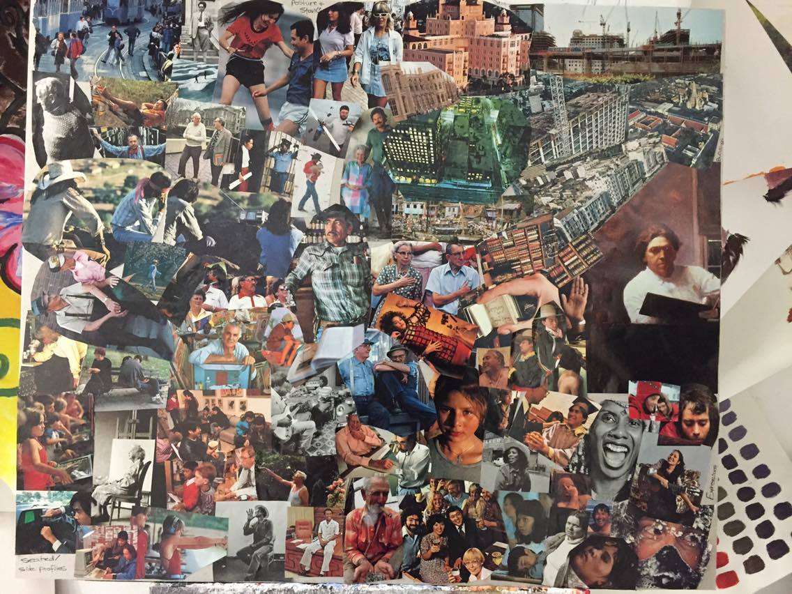
I then had to think and get an idea of how I was going to show off my comic, how it's going to be set up, it's structure, how it's gonna look, have a theme to it, be a classic or unique different style. I thought how I could display my comic without it looking too messy, boring or over-used in style, I wanted it to have a different kind of twist to it. I also had to research and use references for my character development, to use images of people in certain poses standing, running, walking and sitting etc. I cut out references from magazines and put it on a greyboard to use when developing my character and starting on my comic.


I thought about keeping most of my characters
attire to be the school uniform I wore, but I
found this to be too boring and bland, especially
if I reused it multiple times in the comic.


I put my character through a lot of development, mainly with the style of how I draw my character, because each time I draw my character it's always changes in how it looks, it being either with the eyes, nose, hair or face shape. Because of this I tried and practiced multiple times to try and get the same looking character in style. 
I also then had multiple attempts with my hat accessories, trying to draw them right and what kind of textile look they should have.
I tried experimenting a little with layouts of cells
a little more, this time I thought more about the
layout and how I want it to be different. I also
wrote out parts of my story under the cells and drew
them out, quickly telling a vague version of my
journey. 
These are multiple attempts of trying to keep a constant style
in my character, and it's obvious of the different styles of them, this mainly due to the eye and face shape. I also had multiple attempts of my hat accessories. 


Wednesday, 30 March 2016

Review and Analysis of my Comic


Comic Review


The Idea:


The idea behind my comic is my journey from school to NNC college, the obstacles and problems I had to overcome because of the school, the waiting, the stuff I learnt and saw when I visited NNC, how I felt and what I thought and felt throughout it all. Though I mainly wanted to show how I discovered NNC, the kind of problems my previous school gave me and how many times I tried to resolve it by myself before having someone else help, as well mentioning that it took a while to get a response from NNC when I applied. I pretty much just wanted to share my own personal experience of my big step from school to college. 

Influence:

I was inspired by illustrators like Clay Butler, Andy Singer and Joan Cornella since they all have a good style that isn't too messy and keeping their illustrations simple. 

  • Clay Butler's illustrations have a very cartoon looking style to it, having different shapes of heads, mouth positions on the face, body shapes. hair styles etc. Along with a good use of shading and filling in blank spaces with shadows or gradient shades, which gives it the look that it was created with an ink pen, a biro pen. 
  • Andy Singer's illustration has a very interesting shading techniques, using short lines and dots instead of full shading for shadows and other light effects, also making it look like it's been made using an ink or biro pen while keeping a simple but yet still interesting style.
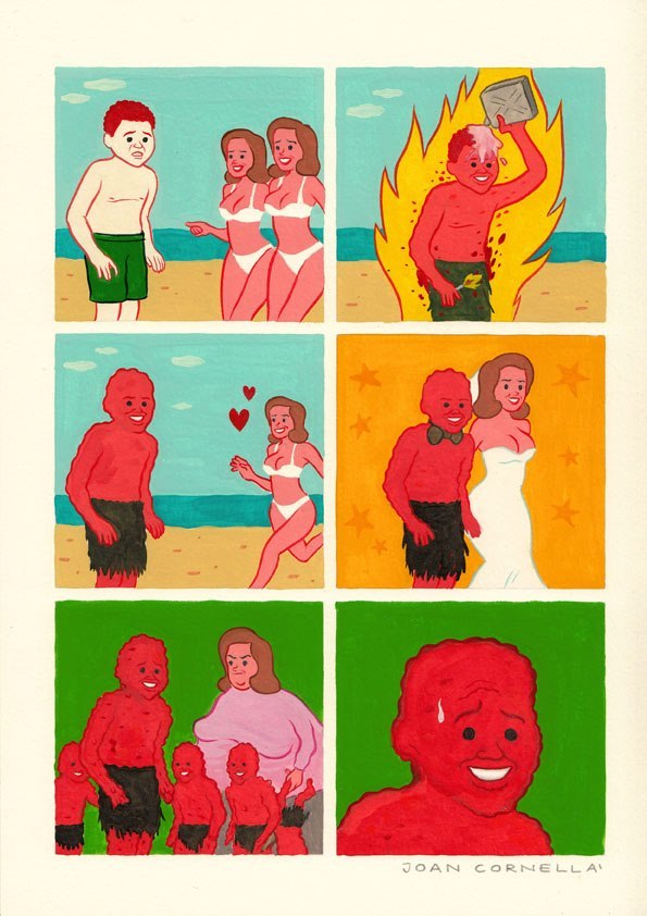
  • Joan Cornella's illustrations are different to the common types of comics due to some of its strange, weird and dark jokes and messages it's giving to the reader, and he experiments with body shapes. His style still stays simple with his characters in his illustrations while still looking quite eye-catching with it's colour palette what's going on in the comic. 

Structure and Flow:

I think the structure and flow of my overall story is good, it has the main details I want to tell are down. The illustrations of the situations and journey to college I had from school to college are understandable and shown clearly. I'm happy with how I've structured the layout of my comic and illustrations along with the use of cells overlaying over cells, giving it a different kind of effect. Though I think I could've improved on the layout a bit, because of the layout of the cells it makes it a little confusing of where you have to read and which cell to move on from to the next. Also on the second page of my comic I started to use more cells for text to explain more of what's going on, so I would've added more of those text cells in my first page of the comic.


Visual Language:

I believe my illustrations show my story in an understandable way, I drew the illustrations in my school environment, to show I was at school, the college environment and public environment etc. I'm satisfied with the style of my illustrations with my own style in it aswell as taking influence from other illustrators and artists like Joan Cornella and Clay Butler, taking inspiration from Cornella with his simple illustrations and Butler's shading technique and style.


Visual Impact:

I believe my visual style of my illustrations has some good visual impact, enough to catch viewers attention. It has a simple style that isn't too detailed or too simple, though I did try and add as much detail I could without ruining it, I added quick lines for shading and shadows, a crosshatching style to it. I think the colours are good, using bright happy colours for when I felt positive, dark dull colours for when it was negative, neutral colours, angry colours etc.
Though I do think I could've done a better style to make it a bit better in my opinion, a better shape or maybe more developed and detailed if I had more time to develop it. Also I think the choice of colours isn't exactly what I wanted, and might seem a bit off, childish or messy with the mix of them and because I rushed a little so some colours are outside of their lines.


Development:

I'm going to develop my work by using shading and colour a lot more careful so it doesn't look too messy and unprofessional, this includes the lines staying within the lines and the shading not being too small or big. Even though I'm happy with my layout I do believe it could've been structured together better, I would develop it by making the cells bigger and more defined next to each other. Also the overall style could've been a bit more detailed or maybe even a different kind of style if I had used other illustrators as inspiration with more detail and different colour palets.

Cartoon Strip Illustration Research


I enjoy this comics relaxed, quick sketched style, it's not overally detailed but is done
to right amount of minimal detail for the viewers to understand what things and objects
they're seeing in the comic. Though the only thing I don't like about the comic is
the writing, though it does look nice and seems to even fit the style of the comic
illustrations, some viewers can't read or understand it very well, though I can
just about make out what this style font of handwriting says.
I researched comic illustrations, sketches and cartoon strips to get an idea of how to style, draw and theme my video scribing, a comic cartoon strip kind of style.
I have multiple kind of styles to choose from, messy, polished and clean looking, realistic and very animated/cartoon looking.


The way Clay Butler has drawn these illustrations has good visual effect to them,
they're not overally detailed, though the shading and shapes of the characters in the
comic adds to the effect, and it also reminds me of the comics that would be
out into newspapers, it has that interesting and quick style look to it.
This kind of illustration has a fancy and quick looking style, being able to draw objects not perfect but enough to understand what they are also while just using blacks, whites and greys. Illustrations like this have an interesting use of shading, using dots, cross stitch and lines as shading and shadows, along with having the characters very cartoonish looking.


These illustrations are quite simple as well, not alot of detail, just the creases in one of the characters jeans, the sofa and pillow. Also the light, calm-like colour palet fills in the spaces and gives it much better effect than if it was just black and white ilustrations.


While still having the calm colour palet and simple and iconic character shapes of the illustration, it has a bit more detail and visual effect because of thickened lines, shadow and lighting effects using colour and not a lined or dot shading like other illustrations do. The style of this illustration has a simple yet eye catching and charming effect to it.


 Though detailed illustrations can be quite strong in visual effect and more interesting, simple, short comic illustrations can be just as interesting and eye-catching, which also depends on what the illustration is of. Some depend on the illustrations and visual effect for it's overall quality, others on the humor, subject and situation in the illustrations for the overall quality, and some comic illustrations and creators depend on both, making they're work very eye-catching, visually effect and memorable.
These kind of illustrations can be appealing both to children and adults, children because of its cartoon style and adults for its humor and situations going on in the illustrations. Though the type of audiences the illustrator would be aiming for would've discussed and developed in the character development for the comic.


The pipboy character, or mascot, from the Fallout series is a good example of a simple character illustration, it's simple design makes it easy to manipulate it into different poses and actions. While keeping it's iconic look and colours, making it incredibly and widely recognizable to many viewers.


Joan Cornella's style is very simple, not using much detail,
lighting or shadows in most of his comics and illustrations,
though I think the main thing that makes it interesting and overpowers
the style is the humour and the illustrations in the comic/picture.
The layout of most of his comics are mostly portrait
with two cells on each row, it's short, quick, eye-catching
and effective, it doesn't get boring with it being too long or
over done, which is especially effective with modern audiences
since their attention spans are getting shorter then they were, Joan
Cornella takes advantage of this with his short comics.


The humour of Joan's comics is the main and most
powerful thing that stands out in his comics, though
sometimes his humour can confuse viewers, that
it's not funny because of what it's about, or because
it's 'offensive', but people who get offended by it need
to remember that it's a comic, it's entertainment, a joke
that does appeal to quite a few people.
Joan doesn't need to use 'time gaps' in his comics, a cell
to say time has passed in it, he just does it with the simple
illustrations he makes. He can successfully tell quite a story
through just a few cells of illustrations and this makes it very
clever and effective towards the reader.


Joan Cornella is one of my favorite comic illustrators, his simple design being able to strongly visualize the situation in the comic, it's weird, confusing and sometimes dark humour. The colour palet varies with almost every comic strip he makes, making a lot of it quite unique each comic.

Monday, 28 March 2016

Character Development

Character development is a very important part and process of making a character, it helps the creator write down and draw out ideas for the character. Though you can base a character off of someone, there are still going to be many and the same kind of steps in even basic character development if you started from scratch with a character:
  • The appearance; hair, eyes, ears, body build, clothing, accessories, weapons. (The colour palet)
  • How they stand/float etc.
  • How they walk, run, jump, fly etc.
  • How and will their personality shown through their appliance and body language/attitude?
I found this image a great example for a very basic look at
character development, how it starts with basic 'scribbles' and
lines of the shape of the character, then developing it into a simple
line drawing, then using grey scale to experiment more with
lighting and shadows, then onto basic colour, experimenting with
colour palets along with lighting and shadows again, and then finally
onto a lot more improvement with colours, shadows and lightnings,
a very professional style that it comes close to real looking.

This is an example of a 'character profile', having multiple different
angles and looks to a character to show how the character would look
in different poses, positions, clothing and angles which overall helps
development in a character much stronger.
This has multiple different characters or animals/beings,
showing different looks, structures, acessories, expressions
of each of them, giving them an overall bigger variety.
This is a good example of a character profile. It shows the characters
simple details, and creators URL on the top right, then the character
in colour at the top left and then multiple positions in a rotation,
at the bottom row it includes 3 different expressions of the character
before a different pose of the character on the far right.
This is a good example of a simple and quick character profile, it looks like
the character has been redrawn with different clothes and facial structure all
with harsh looking shading that is still quite visually effective.
I find this an interesting example for developing a character and the
facial expressions. In the picture you can clearly tell the difference
between the expression and understand them with how well they've been
drawn out.
This character development was for 'Lady and the Tramp' as the
main character 'Lady' can be seen in the sketches with her
different expressions, poses, body structure, different angles of her etc.
It's a good way of developing characters, by putting sketches, even if
they're experimental, of the character and fitting in as much as you can
onto a sheet of paper.
This character development of Flynn for 'Rapunzal' is a great example
of character development, and this is quite a commonly used professional
way developing and confirming facial expressions. It also practices with
drawing the character at different angles and ways they might be facing.
This is a good example of character development, it shows how
much you can develop a character and change it more, mostly for the
better, over time. As shown, the new more developed character looks
a lot more detailed and visually interesting then when it was in 2005.

Dreaming Interpretation

For dreaming interoperation, I had to research actual interpretations people have made out of dreams based on the theme, where it seems to be set in, people or animals in it, objects, weather involved etc. There are hundreds of interpretations of deems, though some websites and people ay have different views and interpretation on a dreams theme, they can mean the same thing when narrowed down. Though apart from writing down other peoples opinions of dream, I also wrote down my own interpretation of themes of a dream, though if it was my own dream it could mean a lot more to me and have even deeper meaning.

I made notes of the meanings that seemed the most interesting to me,
mainly because of how something simple in a dream can have
a deep meaning to something you wouldn't of expected to even be
related to it.


I made notes in my sketchbook and linked up what feelings, thoughts, places, objects, meanings and other
words that were connected to the main list of words I researched and picked out. I developed them all as best
as I could, getting a good amount of different kinds of ideas I could work with to make a piece out of this dreaming
interpretation subject. I was lead up to an idea of the human brain, with a 'third eye' at the front part of it, which had
the meanings of it being the main 'machine' of all living things, creativity, imagination, thoughts, feelings, uniqueness,
spiritual (this inspired to haver the floating jelly looking objects around it), scientific, having infinite amounts of ideas and thoughts that can come from it, a universe itself etc. 
I had some of the words meanings lead up to an idea
involving a cage, feeling trapped, in solitude, a mental cage
so strong that it could be a physical cage. I thought about involving the brain sketch


I was confident in having the brain with the third eye idea, and felt I would be happy with it once I had finished it, though I did decide to not involve the cage part along with it, the brain behind the bars of a cage to show the feeling of feeling limited in imagination, artist/writer blocks, afraid to speak the mind, scared to go beyond boundaries etc. The reason was because I thought how it could ruin the space on the painting, not have it seems as interesting or as bright as I actually want it to be and how it would also likely prove to be difficult to how i would prefer it.
Before actually starting on my painting, I thought what the background colour could be, I didn't want a colour to bright or colourful that would flush out the main part of the painting which was going to have a light colour palet, so I decided on a dark grey, not to bright, though I do think if a darker fray, or even a black, would help the painting stand out even more. 
I did first sketch out the brain shape first on the paper
before I filled in the space 'behind it' with acrylic,
I do tend to work this way, mapping out the basic
structure of my idea with pencil before I even
add a drop of paint to it, I may add more pencil
markings after adding some paint if I want to add
something onto my paintings, which I also do in
most of my work. 
I had done with the basic markings before adding detail,
this being the lines and shapes of the brain and its surface
texture. Once I was satisfied with the detail, I rubbed out the
front part of the brain pencil markings to where the 'third eye'
was going to be drawn, I did some quick basic shape markings
for the eye before adding better detail to it, this including the
iris, the pupil having a very unique shape, and eyelashes.
Confident with how it was looking so far, I began
to add more colour to the brain part first, experimenting
with the paints colours of getting the right kind of
'brain pink' for my painting with watercolour , I tried
multiple times before settling on a colour after almost
5 to 8 attempts with the colour. I coloured in the brain with
the lightish pink, as well with a darker pink for the crevices
of the brazen to have a shadow like effect to them. Once
done with the brain colour I moved onto the eye and used a
golden yellow, which I researched that kind of colour is a colour
of enlightenment, peace, imagination and creativity.