Showing posts with label Unit 34. Show all posts

Sunday, 3 July 2016

Nat Geo Poster


For this unit I had to make a poster that's linked  and slightly resembles the National Geographic books, so I would have to make the boarder, the text and a picture to out on the cover of it. Though for this unit I had technical difficulty with getting access to my work of the Mac server I use, which had me to start over with making the layout of the National Geographic cover file and some photos I had already added filters and effects to.


National Geographic books with covers involving face
portraits and the text on top of them
A National Geographic booklet with a face
portraits and other pictures over it
A National Geographic cover with a photograph
filling up the space of the cover nicely
and professionally
Another National Geographic cover with a
landscape photo on the cover with white text
that's visible on it


I researched examples of National Geographic books, looking at the kind of font that was used along with how big they are and the kind of covers that were used, how portraits were displayed and if I would have to add effects to mine to link to the ones on the Nat Geo books or have something different.

To get a cover for the National Geographic book, me and a classmate grabbed a college camera and a large camera/film light to help give a better look and effect when the photos were being taken. I had quite a few photos of me taken in different poses since I was unsure what I would want for the cover, but also how the photos might turn out. I've narrowed down the photos I used since quite a few of them I didn't like or they didn't turn out well either due to being blurred, when I'm blinking, bad quality, the camera not being focused on the shot etc.

An original version of one of the main pictures I used


A photograph of me making a pose
with my hands shaped around my eyes
A photograph of me taking a pose where
both my hands are across and hiding my face
A photograph of my making a pose
where one of my hands is across my face
A photograph before I was going to flip
my hair up into the air
One of the original photos I added filters and effects to later

One of the photos with a blur and glow effect added, with this
photo I was mainly experimenting with the kinds of effects
and filters there were
The main photo I used with a light, smudge and polterize effect
to make it look like a form of pop art
There were only 2 main photos I wanted to possible use for the cover, both including when my hood is up, I think it just makes the photos look better, fill in more space of the shot and has a certain effect.
I first started editing random photos before settling into the 2 main ones, focusing on one and experimenting with the light, shadows, filters, glows, blurs etc. I experimented with it quickly before moving onto the next one since I wanted to see if the other photo would look better with some effects so I won't waste too much time on the first one.
The second main photo seemed to look better with some effects and filters due to the hood casting a shadow and the film/camera light highlighting the parts that weren't cast with a shadow, giving a much better effect and more control with some of the filters.


With this one I changed the colour palet involved, so I
adjusted the photographs overall colours
The photo with a desaturizing effect on parts of the photo, this
being my face and hair, leaving my coat, hood, top and
lips with some colour
I used a shadowing effect along with the polterizing effect
too, giving a much more different effect than the previous one 
Another version of the shadow and polterizing effect, this one
having stronger range on the photo


The shadowed black and white effected
version of the photograph on the cover

The colour adjusted effected photograph on
the cover
Happy with the different versions with different effects I had done with the main photo, I then moved onto making the layout of the National Geographic book like file in illustrator. I first made the border of the cover with would be about 5mm thick all around, then I moved onto the text of the cover, adjusting the size, font and placement on the cover as requested. 
Once the layout was done I added on the filtered photos onto the cover, adjusting the placement of the photo on the cover until I was happy and confident with how they looked

The shadow and polterized effected
photograph on the cover


With the effected and filtered photographs on the layout, I then decided to change the colours of the covers, changing them to fit with the photograph on the cover, so changing the colours of the border, main background behind the text and photograph and also adding in a small white border on the inside of the outer border, along with changing what the main text and subtext on the cover said.

The first version of the cover with the text
linking to skittles
The final version of the colour effected photo, this
time the text linking to alternate 'alien' colours

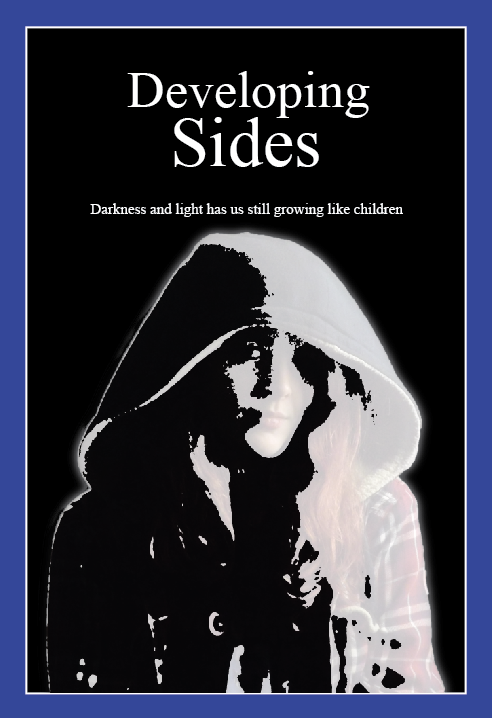
The first version of the black and white
filtered effect photograph linking to
'developing sides' in the main title
The final version of the black and white photo, having
only changed the sub text to about power of darkness
and light


With the colour effected one I thought of having something linking to skittles or alternate colours, like forms of colour blindness with white text, a green background and a bright blue border. With the black and white one I thought of having it link to shadows, light and darkness with white text, a black background and dark blue border. Then with the polterized effected photo it reminded me with a dimension like effect, so I linked it to alternate dimensions and shadows of them with white text, a dark purple boarder and a dark grey background.


Overall, I'm happy and confident with how they've turned out, though I do think my 'strongest' ones are the polterized and black and white covers, the colour adjusted one looking a bit odd and underdone in my opinion.


Wednesday, 29 June 2016

Banner & Poster Design


I took photos around the Art department, mainly of the painted walls that had been done recently done by students, including myself, making the walls look bright, colourful, eye catching and expressive.

An edited version of a picture, I
increased the brightness and contrast

I took quite a few photos inside the art department of the walls and certain angles, and outside the art department of the flowers, reflections, buildings, plant life, certain angles etc. I then moved the photos I would possibly use from the cameras memory card onto the Mac, I picked out some images and edited them in photoshop, mainly adjusting the brightness and contrast to make the colours stand out and 'pop', sometimes inverting them.
An original picture from the camera of a wall
with splattered acrylic
An edited version of the picture, the brightness
and contrast being adjusted
The inverted version of the picture with the
improved brightness and contrast


An edited version of a picture I took of
people in the hallway when painting the walls.

I then opened up illustrator to start making banner designs, the ideal kind of design to have was to have one of the banners using a picture from the camera, then the other being of text, object and or blocks of colour. I first started making a design with unedited version of the photos from the camera, using colours from the photo and putting them on the other banner on squares and rectangles.
I then started trying making designs with edited versions of the photos, but I was still having difficulty making a good design that I was happy and confident with, they were just looking boring and almost childish in design. I tried to get past this 'block' in my design I was having trouble with my adding filters onto some photos, though this still wasn't helping that much to give me better ideas.
My first attempt at making a design with an
unedited photo, and as shown it's not that eyecatching.
A different design I tried doing with an inverted
version of a photo, but the left banner design still
looks childish but also something that's quite overused

A edited version of a photo, as usual the brightness
and contrast was adjusted to help make the
colours 'pop'

A filtered version of the photo, a polterize
filter, giving a cool look and effect


I tried to try different designs for the banners, using a technique from a classmate by putting lines making the shapes of triangles above the pictures I'm using, I first made the lines with the line tool and coloured them with either yellow or blue, then putting an original coloured photo and inverted version of it underneath this design and then using the eraser tool, I erased the parts of the photos that weren't underneath the line design. I thought it was going to turn out quite good and work out, but it resulted in a weird and not that much of an impressive design, with the other banner not looking impressive either. I then tried to use a hexagon design some classmate had used in their design, though when I tried to use it in my own kind of design I just couldn't get it to work in a design. I then tried doing the technique I saw in my research with one banner being of the logo and the other an image with some text, I tried this but I still thought it wasn't looking that good or eye catching.

The technique I used to
make the line filled design,
The design I did with the lines next to the other
banner design, not looking that impressive.
The banner design with the hexagon design on one
of them, still failing to look impressive or good
to me.
My design technique with the logo on one banner
and an image on the other one with some text, I think
it's a good technique but I'm unsure it would work for
what these banners would be used for


Since I was having trouble with making some actual good designs with this 'creative block' I had, I paused with doing my work and looked at my research I had done, but I still wasn't getting anything, so I then I began to look around at other students work, seeing different kinds of designs that actually looked good and some even professional. By looking at some other peoples designs, I actually come up with some ideas, inspired by some of my class mates work, I didn't 'copy' from their designs, but used some techniques they used, included faded pictures and lines going over it.

I started by doing a poster, first putting down the text for Art & Design on a white circle with an edited picture background and then an inverted version of it, then adding on some white lines and 'paths'. Becoming more confident with how my designs were looking, I developed them further by adding in low opacity squares over parts of the design and then finding a space to put the NNC logo, which I place in the bottom right of the poster. I was liking how the poster was looking, but I decided to develop it more by having both of the edited photo and inverted version of it together in the design, so I had the original coloured photo underneath the inverted photo of it, using the eraser tool on the inverted photo in the spaces between the lines so the original photo would show, I then did the same thing the other way round.
The first design I was actual happy and
confident with and developed it further
I added in low opacity squares and put them
in the corners of the poster design along with
the NNC logo 
An inverted version of the design which I
think looks better than using the original
colored photo in the background
The inverted version with the low opacity squares
in the corners of the poster with the NNC logo
The design where I added both the original
coloured photo and the inverted version,
along with an added line path in the middle
I changed the text font to try and make it fit
in better with the design, mainly to fill in
the space around it


Satisfied with how the poster turned out, I moved back to making a banner design, which I would like its design to link to the poster design, so white lines/shapes, shapes with low opacity, using the same original and or inverted photo for the background etc. I tried making a design that has circles instead along with white lines, it looked okay but it didn't match with the poster that I wanted to have it linked and look alike to, so I used the same design with the white lines and paths along with a white stretched circle. Once I had made this design I was actually quite happy with how it was looking, though it only used the inverted background, it still fit and linked with the design.

Another design I made but also had difficulty
developing it further to look better
I tried to use a different kind of design using
linking colours and circles, but it didn't fit the
level of being eye catching like the poster does


The banner design that starts to look the part and
linked to the posters design while having a
 professional look to it

I changed the font to being more bold to
stand out, so when seen from far away on a
banner it would be able to be read

Confident and pleased with the successful designs I had made so far, I then moved onto making a leaflet design, that would still be linked to the banner and poster designs, so ideally look alike photos to the others I had used in my other designs. I did find a look alike photo to use, so I edited them in photoshop, adjusting the brightness, contrast and then inverting it, I then started making the design for the leaflet version, using the same white lines/paths, having the inverted version in one design in between the spaces of the lines and then the original photo. I decided to add in some more lines/another path in the middle of the designs which I think made it look a bit better and did the inverted photo as the main background then the original as the main background. This time I added some white squares to fill in the corner spaces, which is where I placed the NNC logo on a top left and the address and phone number of the college in the bottom right.

The first design I did for the poster, showing I had a good idea
of what I wanted to have in it and shows how I linked it to the
banner and poster design.

The design with an added in path/lines in the middle of the
leaflet, making it actually look a bit better

The design with an inverted version, both seemingly looking
quite good to use

Happy with how my first group of successful designs turned out, I wanted to do another different design for a poster, leaflet and banners but still had difficulty developing any others further. The successful group of designs is what I'll be using, this including inverted versions of some of the designs because I believe they look just as good as the 'original' design.