Wednesday, 30 November 2016

Dada Photomontage


Dada artists were critical of the political strategies that 'dominant social structures' that led to the first World War. They saw the carnage and havoc of the war was proof that the rationalism and order or civilization was an illusion that people believed, though rather than preventing destruction they believed that reason and acceptance was the supreme authority in matters of belief and opinions.
Whenever people were put under strict suppression and forced to follow certain rules, values, principles and to follow guidelines and a fixed path, it would not always lead to success since the people would rebel. The Dada artists brought out their sensibilities, expressing themselves through opposites in various forms, taking the medium of art and literature as their weapon.

With the new systems that were shaping and controlling society, they turned to different and new art making strategies and techniques, so they began to embrace chance, accident, destruction and improvisation in art. This lead to their creations of collages and photomontages which included the practices of craft, control and intentionally, these creations became a form of personal protest and tools for criticizing the violent and mechanized world they lived in. 
To make these photomontages and collages, they used imagery from newspapers, magazines, printed mass media etc. 
The Dada artists wanted to shock and 'attack' the 'bourgeoisie', the capitalist class that owns most of societies money, with their own imagery that had been distorted and formed into a piece with a meaning or message behind it.


Photomontages and collages didn't always look the same, some were quite different from others with different shapes and colours included, though they were linked to being personal protests linked to the first world war and German government.
There were quite a few Dada artists that became a breakthrough in the art community, famous, inspiring to others etc. These include artists like Max Ernst, Kurt Schwitters, Marcel Duchamp, Raoul Hausmann, John Heartfield, Hannah Hoch, Alexander Rodchenko, Johannes Baader etc.

"The Hat Makes The Man" By Max Ernst

Max Ernst made a piece called "The Hat Makes The Man", it's cut, pasted, stacked images of mens hats from a sales catalog. Though the towers of hats are suggestively crude and phallic, and the hats linking to being a symbol for repressed desire.

Dada collage is a combination of images to create a piece of artwork that doesn't necessarily represent anything but a photomontage is a combination of images put together to recreate or make something new.


"Metz Picture 32 A. The Cherry Picture" By
Kurt Schwitters
Kurt Schwitters made a piece with the name of "Merz Picture 32A. The Cherry Picture" which is made up of scraps and objects he had carefully affixed to with glue and nails to a painted board to make a collage and had collected from the streets of his hometown in Germany, Hanover.

The words 'Merz Picture 32A belongs to his 'Merz Series', it being a term he had made up by cutting a scrap from a second syllable Herman word 'Kommerzw' which is also included in his early early paintings.

The piece has many layers, including light and dark paint on the board to form a base for the collage, newspaper clippings, an image of kittens, various fabrics, candy wrappers, a broken pipe which protrudes from the surface, and a flashcard of cherries which Schwitters wrote "I love she!"


"The Rope Dancer Accompanies Herself with Her Shadows"
By May Ray
Man Ray made a piece called "The Rope Dancer Accompanies Herself with Her Shadows", it's made up entirely of oil paint and was one of Man Ray's numerous collage experiments.

Its original composition was inspired by the view of a tightrope dancer in a performance, he cut coloured paper into shapes to resemble the dancers acrobatic movements. Though he wasn't satisfied with how these piece of paper looked on the piece and threw them onto the floor, which is where he then saw an abstract pattern, this was then incorporated into his piece.

The dancer is outlined in grey and white at the top of the canvas, her legs and skirts in various positions simutainsly, the tightrope is depicted in six ways, each line swinging out from the dancers feet atop the large areas of colour which represents shadows cast by her figure.


"3 Standard Stoppages" By Marcel Duchamp
Marcel Duchamp made a piece called "3 Standard Stoppages" which I also included in another 'blog post'.
It looks like a wood based toolkit, he dropped three one meter long threads from the height of one meter onto three canvas strips, the strips were adhered to the canvases, preserving random curves they had made upon landing.

This deliberately useless toolkit links to the standard way of measurement but also simultaneously making fun at the scientific method.


His description of the piece and outcome is similar to a mathematical theory: "If a straight thread one meter long falls from a height of one meter onto a horizontal plane twisting as it pleases, it creates a new image of the unit of length."

International Dada Fair of 1920


The Cabret Voltaire is a museum in Berlin made by Dadaists. he peak of Berlin Dada was the International Dada Fair of 1920, the image was within the Cabaret Voltaire during the second World War, the central symbol was an effigy made from a a mannequin doll and dressed to look like a German officer with the head of a pig hung from the ceiling. An example of a Dada artist expressing their opinion in a different form of the war.


Raoul Hausmann was known as one of the founders of Berlin Dada, he always worked against and defying the Capitalist regime and showed his concerns about it through his work. 
Being part of the Berlin Dadaists they were more demonstrative and were more inclined to express their worries and concerns towards the social and political groups, so with Haussmann's versatile personality and being a great designer, artist, photographer and in literature, he used all of these talents to make photomontages, collages and other art forms as a protest mechanism against the system. Throughout Haussmann's life, he was more inclined towards painting and literate and tried to voice his protests through them in his art and poetry.

Raoul Hausmann was born on the 12th of July, 
1886 in Austria-Hungary in Vienna and died on 
the 1st of February 1971 at the age of 82 in France.
Haussmann was regularly contributing articles to Der Strum, a German art and literature magazine, in collaboration with other writers like Franz Jung, a writer economist and political activist in Germany, though Haussmann's articles were more satirical and were aimed to critic the Capitalist in a subtle tone.
When he returned to Berlin in 1917 he was introduced to the contemporary literature magazine 'Cabaret Voltaire', and during the time that the Dadaist movement was spreading to Berlin, Hausmann prepared his weapons of art and literature to paint his canvas and use his words to express his protests and channel his social and political oppositions through his art form, though it was only after a successful meeting and vacation with the fellow Dada artist 'Hannah Hoch', which he had an extramarital romance with, that he then developed his techniques of photomontage and an explosive future for him. It was during their vacation to the Baltic Sea that the idea of photomontage inspired him, which he then picked as his new art form, building it to vent out his protests and Dadaist claims.


Dada Siegt
In 1920, Hausmann had began experimenting with the new type of art photomontage which is influenced by collage cubism, fitting different elements of text and photographs into a single work of art, though he also believed that this form of art was more comparable to common man than those in higher class societies.

Dada Seigt is a Dada style and a good example of the usage of collage techniques over watercolour and other media, it also seems to include an aspect of a representation of Haussmann's personal life, with how he saw things and how different it may be to him compared to someone else. Each image on the piece seems to stand out on the solid background of the walls and floor, it not being too crowded nor too empty and spacious. Hausmann created shadows in the composition behind each figure, adding more detail and dimension into it aswell as a form of aspect.

Tatlin at Home


Tatlin at Home photomontage presents a situation in which how the human mind is controlled by a rational and unemotional thought, and that the war that ravaged Europe is what had made society to make decisions influenced by such an emotion.
The central subject of the work is the Russian Constructivist artist Vladimir Tatlin who was an artist and architect for the Constructivist movement, which is devoted to using art for practical and social practices. So this piece of work was Hausmann trying to send a message to people about the dangers of their irrationality, representing Tatlin with a machine that has replaced his brain, representing 'mechanical thought', and being free of any emotion.
The overall aspect of the 'Tatlin at Home' piece is that Hausmann was promoting rational thought, but in a an irrational manner, which is what Dada is and does in art.

Dada Seigt and Tatlin at home were produced during 1920, photomontages of Hausman 'spelling' out his discomfort and concerns towards authority, especially when he, like many others, were forced to not express their thoughts or in any manner they felt.

ABCD


ABCD piece, made in 1922, looks as an intense piece with the colours and placement of shapes, words etc. It's actually a self portrait of Hausmann, his mouth is open and clenching the letters 'ABCD' with an expression that looks like he's screaming and experiencing discomfort, showing his discomfort towards the authrority and trying to express his concerns but can only clench onto them and not express them in the manner they felt. There's also some information of one of Hausmann's upcoming poetry readings within the piece, being a reference to literary side of the Dada movement.
Tickets are cut up and scattered in various places, along wit hands, money, an extinguisher and various words hidden within the piece and symbols which Hausmann used to encourage the audience to challenge beliefs and create individual opinions. Some might see it as having a hideous meaning while others might see it meaning something else.


The Mechanical Head (The Sprit of Our Time)
The Mechanical Head was one of Hausmann's well known pieces, it was finished in 1921 and was assembled out of many common tools on a wooden head, common devices such as a ruler, a watch and parts of a typewriter, all being devices of measurement and information, the head being changed into its own form of an instrument. The human form of the head captures the essence of people in his time, lacking expression and feeling with no memorable or special qualities which is probably why Huasmann chose it.
The head is simple and symmetrical, with no pupils, hair or ears, the 'man' having 'lost' it's uniqueness, representing the German man in the following years of World War 1.
Compared to previous pieces Hausmann had made on the human form, it's not as complex and shows a different sort of man, not confronting an issue of the anatomy of the human body, but of the human mind.
He implies how people have become slaves to the devices around them, disillusioned on them to make decisions, relying on them to survive with the lack of creativity and emotion and to show that people had became cold and mechanical.

Hausmann believed that the German society had lost its human spirit due to the result of the country's condition after the first World War, the country was devastated after losing the war and many Germans had died with countless more crippled of injured.


The Art Critique 
The Art Critic was made to show how Hausmann and others within Dada disapproved and had become disgusted with the more traditional art styles and the lifestyles they had represented, the piece challenges the idea of it as well as how the critics qualifications and motivations for deciding what is acceptable art.
The Art Critic can also be interpreted as a representation of society as a whole during his time, Hausmann didn't agree with the lack of individuality, he was also against the influence of money especially within the capitalist society but supported new, different forms of art.
The chaotic placement of the photographs and cutouts express his feelings, the centre subject of the piece is The Art Critic, using the cutout of a man with a head that is much larger than the body who is identified as another member from Dada, George Grosz whose name is stamped on the photo but crossed out with red crosses. The man's mouth and eyes are cartoonish, drawn with coloured pencil, the 'art critic' is holding a large pencil, then beside the man is a woman and the shape of a man cut out of a newspaper.

The distorted face of the critic represents how the critics opinions are irrelevent, bias and distorted, the words in the background being the critics words, loud and hard to understand, the pencil represents a sword, showing how much power he has with his weapon, his eyes that are drawn messily cannot properly see art as they should and only sees what he thinks the woman, a member of high society, wants him to see since they have money and that the art critic has became a slave to them. So whatever opinions he may have they are unimportant and untrue to Hausmann.


Was born on the 19th of June, 1891 in Berlin
in Schmargendorf, his original name being
Helmut Herzfeld.
John Heartfield was a perfectionist and at first a landscape painter, but as he was introduced to the Dada movement by George Grosz in 1916 he became the pioneer of photomontage.
He worked on his method of reusing and appropriating photographs into a strong, powerful and mostly political pieces, expressing his opinions through his work with the reused photographs, for example, a poster trying to promote positive views on Hitler then being changed into something that promotes negative views about Hitler.
The images Heartfield made reflected on the chaos Germany experienced in the 1920's and 1930's as it was controlled by communists and Nazis, falling towards social and political chaos as Nazi Germany came into power with their rules, social construct and strong, aggressive political views.
Died on the 26th of April, 1968 in East Germany,
East Berlin.
Heartfield's work were mainly photo-based and included the symbols for the communist party, the Nazi swastika and Hitler, his face over the body of a monkey to show what Heartfield thinks of him. It included images of clenched fists, open palms and raised arms, all representing determination and bold action. Much of Heartfield's work was political referenced to historical events or reflected on earlier works of another artists, either promoting or disagreeing with their work, depending on their views and what the art was for or representing.


A Berlin Saying

A Berlin Saying, made in 1929, was an iconic piece by Heartfield and had appeared on a hugely successful literature magazine by the Dada movement he had collaborated with Kurt Tucholsky.
Putting ears on the sides of the trousers was considered to be a simple yet iconic design the Dada movement used, it was seen as quite an effective way to show opinion through a piece about something and representing it as silly, stupid, childish, someone talking out of their backside etc.
The piece was seen as quite a devastating critique of the Weimar Republic, an unofficial German state between 1919 and 1933.
Adolf, The Superman: Swallows Gold and
Spouts Junk


Adolf, The Superman: Swallows Gold and Spouts Junk was made in 1932 and being one of his several famous images he made, using his Photomontage technique, Heartfield created a satirical image by combing different photographs including the face of Hitler, a column of gold coins, X-Ray of a human body and the Nazi party swastica placed over where the heart would be.
Heartfield refers to the large donations that wealthy industries and companies were making to the Nazi party, resulting in Hitler having a large amount of financial support and noting being fair to the working people like he said he would in some of his speeches.
The X-Rayed torso is used as a metaphor to expose Hitler's hidden interest in wealth and financial power, contradicting to his pro working class speeches and showing that he doesn't actually care about the working people.


And Yet It Moves

And Yet It Moves was made in 1943, it's quite widely accepted that this piece is actually a reference to a scientist called Galileo, who was persecuted for his theory that the earth revolved around the sun, a correct theory which many had disagreed on and caused him to be persecuted. Though when he was released from the Inquisition, Galileo stomped on the ground and said "And yet it moves." Which was then quoted to be used as the title for Heartfield's piece.
The piece shows Hitler as an ape with a sword, the sword symbolising military power which threatens the world as it spins, helmet, horns and armband with the Nazi swatisica, while sat on top of Europe. With Hitler being depicted as a monkey to show that his evolution as a human and man has stopped, that he behaves like a primitive animal and not as a sane person. It could also be predicted in the horns on top of his head to represent the actions he's taken and related to 'Satan' and having a vision of world domination, though despite all of that, the world is shown as to still be spinning.


Hannah Hoch

Hannah Höch was one of the only women able to display her work in the Dada movement of 1920 during the first world war, creating some of the most radical pieces of her time. She had strong opinions on the German government, rejecting it, but focused her criticism more on gender issues, though was also recognised as a pioneering feminist artist. She was a partner to the fellow Dadaist Raoul Hausmann for a period of time.

Hoch took inspiration from Pablo Picasso's works and a fellow Dadaist Kurt Schwitters. Known for her collage and photomontage works with dynamic and layered style, putting images together from popular magazines including fashion and illustrations, making humorous and powerful pieces. She preferred metaphoric imagery than the more direct, text-based, confrontational approach, something John Heartfield's work was which she found 'tedious'. Her work included appropriating and rearranging images and text from mass media to sometimes critique the failings of the Wiemar German government. 


Untitled
Untitled was made in 1920, unlike most of her works, instead of focusing on depth in this piece, it focused on and had more intensive patterning, though people believe that this piece reflects on Hoch's commercial work creating crafts for women's magazines.
The background consists of lines and markings making up patterns with how fabrics would, various mechanical images are placed upside down on top of the pattern with a man pointing at one of them, representing the newly industrialised world and how they seem to look by modern artists.
Hoch links how we see mechanical objects to be linked to males, the mechanics being viewed as male imagery which Hoch also links it to subverting the patriarchy by the means of turning the mechanical images upside down, this also references to Huasmann's "Mechanical Head Spirit of the Age"
On top of the turntable is a female figure, seeming to be stretching next to a male figure to her right, who is pointing to at her figure. A theory of the piece is that the male gaze is said to be asserting power when staring while the turntable suggests movement of the female figure so the movement is repetitive and predictable, so her dance would attract the male gaze.


Grotesque
Hannah Hoch's photomontages were normally pieces of work that communicated her views on social and politics that had been built on the exploitation of women and used her artwork to alter the representation of these views in society. The two cut out heads placed on two feminine legs creates emotions that Hannah was trying to transmit of lust, disgust and anxiety, the women's facing having a beautiful eye and red lips while the mans is old with two big eyes with lust, one being red and bigger than the other eye. Both of the bits of faces are placed on top of two girls legs, giving the viewers a provocative insight on the idealized perception of women in society.


Cut through the Dada Kitchen Knife through the
Last Weimar Beer-Belly
https://www.artsy.net/artwork/hannah-hoch-cut-with-the-dada-kitchen-knife-through-the-last-weimar-beer-belly-cultural-epoch-in-germany (for kitchen knife)


Love


Friday, 11 November 2016

Surrealism

Surrealism had began to exist in the 20th century because of a french poet called Andre Breton, making two official surrealist manifestos in 1924 and 1929, though there was a third surrealist manifesto that was never launched.  The word surrealism had originated from the french language, having two main forms of surrealism can be seen, the first being 'Oneiric' dream-like imagery, the other being 'Automatism' a process of making automatically, drawing and writing using the unconscious mind. Its aim was to reveal the unconscious mind and present it within the 'real world' or 'reality'
Key artists within the movement were:
  • Salvador Dali
  • Max Ernst
  • Rene Magritte
  • Joan Miro
  • Lucian Freud


Rene Magritte was a Belgian surrealist artist and was known for his number of interesting, witty, deep and thought provoking images. He was an internationally acclaimed surrealist, he often depicted ordinary objects in an unsual and surrealist context, believing that what is concealed is what is more important than what is in open view, his art pieces would challenge observers perceptions of reality, his work has influenced pop, minimal and conceptual art


A surreal poem that Cabrae Voltaire had
collaborated with the surrealist movement
A famous Dali art piece with strong and obvious surrealist context


Salvador Dali was known for his oddball, unusual and eccentric actions and personality that grabbed the publics attention to him, sometimes more to him then his artwork. He was a skilled draftsman known for his striking and bizzare surrealist artwork of paintings, sculptures, photography, drawings and short clips he made while working in collaboration with many other artists, taking influence from Renaissance painters. Many of his art pieces have hidden meanings and symbolism, some easier to understand than others.
His association wasn't as expected with the surrealist movement, even though he was the most famous artist within the surrealist movement, he was often criticised for love of attention and commercial desires.

Thursday, 27 October 2016

Word Research


Semiotics
Semiotics is the study of signs and symbols and their use of interpretation. Images are able to tell stories through them, this could be through signs, symbols or cues that are combined into patterns to create and try and transmit a message to the audience.
There are three different kinds of Semiotics:
  • Iconic - An iconic sign looks like what it is representing itself as. E.g. a portrait is presented as a portrait, a moth being represented as a moth, a real shaped heart representing a heart etc.
  • Symbolic - A symbolic sigh doesn't look like what it's representing and that its true meaning must be learnt, it meaning being arbitrary, based on personal choice, because it is based on cultural meanings and links. E.g. the statue of liberty, a company's logo, a cartoon heart representing a heart etc.
  • Indexical - An indexical sign is a clue that links to a meaning or multiple meanings, it's linking wouldn't be arbitrary but instead physically or casually linked. E.g. smoke is an indexical sign for fire, a finger pointing is an indexical sign of whatever it may be pointing it, a thermometer wit a high temperature is an indexical sign that it's hot, someone holding their chest is a indexical sign and link of the heart. etc.
Artwork normally includes at least one of these Semiotics, but some artwork and artists include all three of the semiotics and still successfully be able to tell a story through the art piece.


Mise-en-scene
A French word, can be the process of setting a stage to correctly present the placement of actors, scenery, properties, objects, lighting etc. Mise-en-scene can set moods, a characters ambitions, thoughts and feelings, making the viewers notice and realize things they wouldn't have before, leading their eyes and attention to certain parts, areas etc. while still be able to visually and successfully tell a story.
It can also be used to explain why something is included within a piece of art, e.g. Salvidor Dali's piece -----, the banana bunch representing male genitalia that's next to the statue of a realistic female statue, suggesting intimacy of the male and female sex. A moving train in the background which would have been used in movies to represent couples having intimacy between each other, e.g the couples run towards each other and then a train goes past them, covering to camera or cutting to the clip of a train, the train representing their 'intimate' moment or scene.

Composition
The act of combining parts or elements to form a whole, completed piece. There are 8 elements within a composition of an art piece, though not all art and artists include them all in their work due to their ideas or techniques.

  • Unity - That all of the parts all seem and feel like they belong together, but if not it seems like something is stuck on, awkwardly out of place
  • Movement - There are many ways to feel and see movement in a painting, depending on the artist and their technique, such as an arrangement of objects, position of figures, a river etc. Leading lines to guide and direct the viewers eyes into and around a piece of art, though these can be actual lines, lines of a railroad or fence, or they could be implied lines such as a row of trees or a curve of stones.
  • Balance - That one side of a piece doesn't seem to heavy on one side, but is presented evenly, having symmetrical arrangement creates a calm feeling while asymmetrical creates a more dynamic feeling, a piece that has no balance can create a sense of unease.
  • Rhythm - In the same way music does, a piece of art can have a rhythm or 'underlying' beat that leads your eye to view the artwork in a certain place, this can be done through shapes and repeating colours.
  • Focus - The viewers eyes can quickly and easily adjust to rest on the most important thing, or focal point, in the art piece or what seems to be. If there was no focus the eyes would wander the art and feel lost.
  • Contrast - Paintings with high contrast, strong differences between light and dark, having a different feeling than minimal contrast in light and dark, though contrast can also be differences in shape, colour, size, type of line, texture etc.
  • Pattern - A regular and/or repeating lines, shapes, colours or values in a composition, a symmetrical or unsymmetrical pattern etc.
  • Proportion - How things fit together and relate to each other in terms of size and scale, either being big or small, close, nearby or distant etc.


Visual Narrative
A story told primarily through the use of visual media.
There are also meanings and 'flavours' within narrative images, flavour can be a narrative or a 'meta-narrative' that is present in the:
  • Linear - Depicts the passage of time and/or space in a single image.
  • Paneled - Depicts 'non-temporal' relationships between things in a single image that's composed of multiple parts.
  • Aggergate - Depicts the passage of time and/or space in multiple sequenced images.
Most narrative images come from advertising, such as cigarette ads show those smoking their brand are sexy, smooth and cool, which is literal, though the implied and connotative meaning is that the brand of cigarettes will make you rich, sexy and powerful.


Kenzo video


Sunday, 18 September 2016

Detail and String


Starting off, my main aim in my work was to focus on detail, so stuff I might not pay attention to normally, paint splatters on the walls and floors, patterns on desks, furniture, flowers, plants, chips and dents, lines, scratches, shapes that were hidden in detail all around the department.

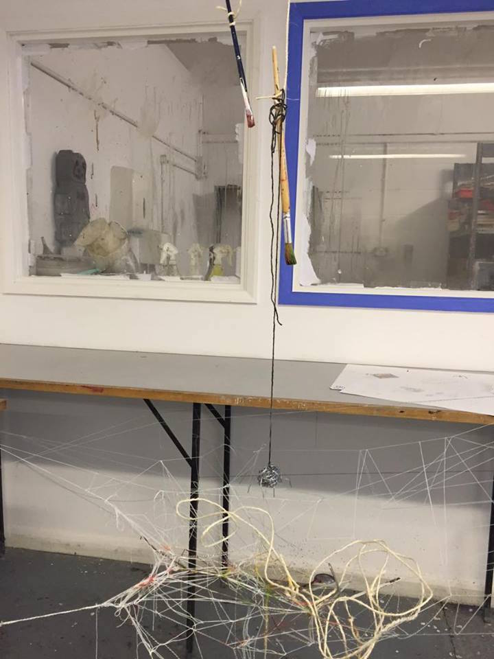
Starting class, the Foundation students had started making an exhibition within the room, it being made up of string, connected to the walls, door handles, floor, tables, chairs etc. Some strands of string extending across the entire room, others weaved together with different string making patterns, some hanging loose from the bodies of string.
We then had to record the detail of the string, it's from, colours, directions it's going etc. but through any media, so being recorded by taking pictures, videos, drawing, painting, sound recording, poetry, chalk and charcoal, wire, clay etc.

I first took pictures of certain parts of the string in the room, taking in the detail of their positions, colours, patterns etc. Before then drawing them up in pencil, pen, chalk and charcoal and then watercolour, adding a description of its form, if colours or patterns were included, if the string was weaved together and then what I thought it looked like and what kind of illustration, place or thing it may of looked like.


Evidence of my drawn work in pen and pencil.
I did it from a certain area in the room of the
 string, describing what it looked like and what 
was included.
I had drawn this in pen. Image of lines of string
coming from different directions from eachother
and joining at a middle point, making a small ball
or clump of string. I drew the red string to be
darker and thicker, the stripped string having little
diagonal black lines, while the white plain string is
drawn as a light pen line. It seems to make a similar
image of a location on an old map, the stripped lines
being train tracks, the other two being roads and rivers.
Drawn in pencil. Image of lines of string weaving
between other string to make a pattern as it's all
suspended in the air. It takes on a form where the
string all connects in some way, only a few lines
of string loosely hanging from other string. It's in
the form of when someone is making a tarp room,
but at the same time gives the image of looking like
a tornado, its shape and string being wrapped
around it.

The first two drawings/recordings I did focused on two different parts of the string that expanded across the room, though they weren't too far away from each other.
I mainly looked for certain patterns in my view to record and draw but being different from another part of the body of the string. The threads of string that were weaved together were white with two main supports of a dark red ad green string, the other threads of string that connected together while coming in different directions involved white, red and a white string with black stripes.

Evidence of my drawn work in chalk and charcoal.
I did it from a certain area in the room of the
 string, describing what it looked like and what 
was included.


The third recording/drawing of a view of string within the room was drawn in chalk and charcoal, a bit further from the other two bodies of string I had previously recorded.
Like before I looked for detail of the string, the shapes it made and the colours involved. There was a main white string running through the middle which supported to other white pieces of string and a red string which was wrapped around it,making a small hoop/noose shape in a certain part and angle of the string.

A room filled with string, like a giant spiderweb
Messy and complicated,confusing and dangerous
An obstacle spread throughout the whole room
On the walls, the ceiling, the chairs, tables, the doors
Patterns and weaves of the lines of string suspended
In the air with colours of red,blue green, white and black stripes
Crawling space being the only path to use to move around
Ducking and crawling,pulling of caught string in hair,clothes
Under shoes, it really seems like a human spiderweb
Hoops of wire and tufts of string hag from the mazes body.


I also recorded the room of string in writing, literature, a poem of some kind, saying how it looked, what it felt like to me, what it reminded me of, what it resembled and seemed to link to etc. This was a form of recording that was suggested but I hadn't done before, though it was also done in an automatic way, not planned but just wrote down what came to my head when I looked around the room at the exhibition of the threads of string, and in conclusion I'm happy with the recorded piece I did in writing.


Having recorded the detail of the forms of string I then moved onto making things to add onto the string exhibition. I struggled for quite a bit to think up an idea,though one of my classmates next to me was making a puppet out of wire, this inspired me to make wire models to hang from parts of the string around the room.
My first model was a attempt to make a skull shape which started off as a weird shape, as I tried to fix it and wound the rest of the wire around it, it had began to start to look like little fish, so I finished wrapping the wire around it and made a small hook at the ed so it would easily hang from a piece of string.

A small wire sculpture in the shape of a
small cartoon style looking fish
I had a hook on the end of the wire so it would
easily hang onto the string structure that was
around the room


I then tried again to make a skull shape, this time I was more successful. Once I had made the skull I started to then make a chest by wrapping wire around my index and middle finger that was in a glove, then connected it to a straight piece of wire that had a hook at the end which I inserted into the head wire piece and hooked it to a bit of wire. With the head, chest and neck/back connected I started to work on a pelvis which I just simple wrapped around the bottom of the back wire, after I then made simple straight wire legs with hooks at the end so it would hook ad connect onto the pelvis, then I made arms to connect to the chest with hooks as hands so it would easily hang from string in the exhibition. The result of my wire model seemed good to me, though had taken a while to make I was happy with how it turned out, taking on the form of a human/man hanging from the string by holding onto it.


The wire sculpture I had tried to make
resemble a human body as much as I could
I made hooks on the ends of the wire where
hands would be so it could hang from the
bodies of string

Another structure I had made to try a resemble the animal body
of a monkey with a long tail


I made hooks in the hands and tail of the
piece so it would easily hang from the
string like a monkey would in trees
My third model was made the same way as my previous one, made a skull shape, arms with hooks, legs, pelvis, though instead didn't add a pelvis and instead of one, I had made two chest pieces which I then merged together since they seemed a bit to spaced out alone. Also the back wire was longer which I then wrapped another two wires around it to make it thicker and more sturdy, looking and resembling a tail. Once done I hung the third model up by the hooks in the hand and tail, I was a lot happier with how this one had turned out since it was a little different from my previous one and had been a lot quicker to make, taking of the form and resemblance of a monkey using its tail to suspend itself in the air.


Onto my fourth model, I decided to make something a little bit different, with a much more different form and would be quite quick to make. I made a long piece of wire as a body and then wrapped two more pieces of ire around it to make it more sturdy and thicker, I then made a head shape with short pieces of two wires wrapped around each other poking out of it, wrapping the body wire with some of the head wire. Once done I had to strategically place it on the string structure and slightly wrap some string around it so it would stay in place and not tilt,it taking the form and resembling a snake.

A wire structure I had made to resemble the body of a snake
with a tongue poking out from its mouth
The shape of the structure as a snake would just have it to
easily sit on the string and slightly wrap around it aswell

My final last model was also going to be quick and easy to make due to its simple form. I wrapped up a ball of wire and then added on eight more pieces of wire to it,semi-wrapping them so they were secure and stick out from the model to resemble legs. Once finished it had taken the form and resembled a spider, a cartoonish style of one,which I then added onto another classmates piece of work since they had made a spiderweb pattern out of some thin rope, hanging the spider above it with some thick string that was attached to hanging objects attached to the ceiling. Even though it was quick to make I'm happy with how it turned out.


I hung the spider structure with someone else
piece, a spider web with paint dripping onto
paper beneath it
A wire sculpture I had made to resemble
the look of a cartoon spider


The wire spider hung from some black string
over someone elses work of a spider web


Sunday, 3 July 2016

Nat Geo Poster


For this unit I had to make a poster that's linked  and slightly resembles the National Geographic books, so I would have to make the boarder, the text and a picture to out on the cover of it. Though for this unit I had technical difficulty with getting access to my work of the Mac server I use, which had me to start over with making the layout of the National Geographic cover file and some photos I had already added filters and effects to.


National Geographic books with covers involving face
portraits and the text on top of them
A National Geographic booklet with a face
portraits and other pictures over it
A National Geographic cover with a photograph
filling up the space of the cover nicely
and professionally
Another National Geographic cover with a
landscape photo on the cover with white text
that's visible on it


I researched examples of National Geographic books, looking at the kind of font that was used along with how big they are and the kind of covers that were used, how portraits were displayed and if I would have to add effects to mine to link to the ones on the Nat Geo books or have something different.

To get a cover for the National Geographic book, me and a classmate grabbed a college camera and a large camera/film light to help give a better look and effect when the photos were being taken. I had quite a few photos of me taken in different poses since I was unsure what I would want for the cover, but also how the photos might turn out. I've narrowed down the photos I used since quite a few of them I didn't like or they didn't turn out well either due to being blurred, when I'm blinking, bad quality, the camera not being focused on the shot etc.

An original version of one of the main pictures I used


A photograph of me making a pose
with my hands shaped around my eyes
A photograph of me taking a pose where
both my hands are across and hiding my face
A photograph of my making a pose
where one of my hands is across my face
A photograph before I was going to flip
my hair up into the air
One of the original photos I added filters and effects to later

One of the photos with a blur and glow effect added, with this
photo I was mainly experimenting with the kinds of effects
and filters there were
The main photo I used with a light, smudge and polterize effect
to make it look like a form of pop art
There were only 2 main photos I wanted to possible use for the cover, both including when my hood is up, I think it just makes the photos look better, fill in more space of the shot and has a certain effect.
I first started editing random photos before settling into the 2 main ones, focusing on one and experimenting with the light, shadows, filters, glows, blurs etc. I experimented with it quickly before moving onto the next one since I wanted to see if the other photo would look better with some effects so I won't waste too much time on the first one.
The second main photo seemed to look better with some effects and filters due to the hood casting a shadow and the film/camera light highlighting the parts that weren't cast with a shadow, giving a much better effect and more control with some of the filters.


With this one I changed the colour palet involved, so I
adjusted the photographs overall colours
The photo with a desaturizing effect on parts of the photo, this
being my face and hair, leaving my coat, hood, top and
lips with some colour
I used a shadowing effect along with the polterizing effect
too, giving a much more different effect than the previous one 
Another version of the shadow and polterizing effect, this one
having stronger range on the photo


The shadowed black and white effected
version of the photograph on the cover

The colour adjusted effected photograph on
the cover
Happy with the different versions with different effects I had done with the main photo, I then moved onto making the layout of the National Geographic book like file in illustrator. I first made the border of the cover with would be about 5mm thick all around, then I moved onto the text of the cover, adjusting the size, font and placement on the cover as requested. 
Once the layout was done I added on the filtered photos onto the cover, adjusting the placement of the photo on the cover until I was happy and confident with how they looked

The shadow and polterized effected
photograph on the cover


With the effected and filtered photographs on the layout, I then decided to change the colours of the covers, changing them to fit with the photograph on the cover, so changing the colours of the border, main background behind the text and photograph and also adding in a small white border on the inside of the outer border, along with changing what the main text and subtext on the cover said.

The first version of the cover with the text
linking to skittles
The final version of the colour effected photo, this
time the text linking to alternate 'alien' colours

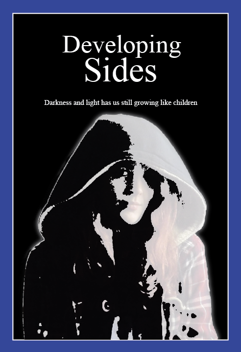
The first version of the black and white
filtered effect photograph linking to
'developing sides' in the main title
The final version of the black and white photo, having
only changed the sub text to about power of darkness
and light


With the colour effected one I thought of having something linking to skittles or alternate colours, like forms of colour blindness with white text, a green background and a bright blue border. With the black and white one I thought of having it link to shadows, light and darkness with white text, a black background and dark blue border. Then with the polterized effected photo it reminded me with a dimension like effect, so I linked it to alternate dimensions and shadows of them with white text, a dark purple boarder and a dark grey background.


Overall, I'm happy and confident with how they've turned out, though I do think my 'strongest' ones are the polterized and black and white covers, the colour adjusted one looking a bit odd and underdone in my opinion.