Monday 26 January 2015

Peer Assessment & Self Evaluation

Peer Assessment

Hannah -
P1. Yes, she showed and described the 3D techniques she used.
P2. No, add more sketches of her character.
P3. Yes, has just about the information and research she did.
Comments: Blog needs to be more organised
Need to upload all design work to blog.
Photos, drawings and links to information on the blog.

Jake -
P1. Yes, he included photos as evidence of his work.
P2. Yes only just as he included just the right amount of photos of his sketches.
P3. No and yes, he wrote about visual language but didn't include them in his evaluation.
Comments: Annotate images on the blog.
Not a lot of examples were used.
Used formal elements but didn't describe how he used it.

Tristan -
P1. No, he didn't include information including health and safety.
P2. No, had no evidence of his design ideas for his set.
P3. No, had no work linked to elements in 3D visual communication.
Comments: Needs to add more evidence.
Has to talk about and explain health and safety.
Needs to include information of 3D visual communication within his work.

Brad - 
P1. Yes, included evidence of his life work such as his clay models.
P2. Yes, had photographs of his drawings.
P3. Yes, overall included good research.
Comments: Included a good amount of evidence and research.
Have more information on primary and secondary sources.

Cameron - 
P1. Sort of, he has explained his work but hasn't included evidence.
P2. No, though he had included evidence of his 3D models.
P3. No, he hadn't included much information of 3D visual language elements.  
Comments: Needs evidence of where his ideas and research came from.
 Needs to add more detail and information about the elements of the work.
Cora - 
P1. Yes, has evidence of some ideas and research to get the ideas.
P2. Yes, photographic evidence is used.
P3. Yes, gives points of work and some research. 
Comments: Needs to have evidence of original ideas.
Include primary and secondary sources.
Include more photos of drawings and sketches.
Have a complete self evaluation.

Tom - 
P1. Yes, he's shown evidence of his 3D models.
P2. Yes, included evidence of his sketches including primary and secondary sources.  
P3. No, didn't include or explain much about the 3D elements.
Comments: Put in more photo evidence of sketches, research used for ideas etc.
Include and explain 3D elements.

Marcin -
P1. Yes, he wrote about the health and safety.
P2. Yes, he included photos of his 3D and 2D work, step by step.
P3. Yes, though could use better photos.
Comments: Some of the health and safety is separated, so it would be best to link them of move them closer.
Needs to add more photos as evidence.

Matt -
P1. Yes. He included health and safety with some photos.
P2. Yes, he demonstrated use of materials that he showed in his photos and evaluation.
P3. Yes but he needs to add and show more visual language.
Comments: Needs to add more photos of work.
The flower included needs more information about it
Needs to be written in more detail.

Tyler -
P1. Yes, included picture evidence of her work throughout.
P2. Yes, showed plenty of information of primary and secondary sources she used.
P3. Yes, she described the visual communication elements as she also gave examples of them.
Comments: Overall work was professional and organised, using hyperlinks within work.


Self Evaluation
P1. Yes, I demonstrated the use of some 3D techniques.
P2. No
P3. Yes just about, because I didn't mention all the language techniques.
Comments: Use more pictures of my sketches as evidence of my work.
Explain and include more of the 3D elements.

The process of viewing one another's blogs helped give me a better understanding of the constructive criticism I received on my work and how I can improve. The group overall being truthful towards each other with friendly and constructive criticism. 
I believe I could of explained and understood visual communication elements better, listing down the line, value, texture, shape, colour, form and space.
After seeing how some other blogs are organised, I'll try to start using hyperlinks within my work.

Criteria Covered by Tasks

Sunday 25 January 2015

3D Art


3D Models

This part of the work included making my character into a 3D physical model that I had previously planned and drawn out on paper.
Firstly I had to make a wire frame/structure that would shape the character into a familiar looking model, wrapping and hooking separate wires together, such as the arms to the shoulders, and then mold clay over the top of it, not having to worry about colours or movement since the clay would harden after it had dried. I hoped it would stand up by itself by how I would've proportioned the clay, only later I had realized it would've of been able to stand up easier if I had made the proportions larger at the base of the model.


The second time I had to make the model I was using colored plasticine. Like before, I made a wire frame/structure, wrapped, tied and hooked wire pieces together to make a skeleton looking character before adding on the plasticine. I had planned to make the legs longer and arms more proportionate to the rest of the body, but once I had made it I thought it fitted the theme I was going for with the box, especially with the long and strange looking arms and slight slouch in the stance the character had. I went for basic colours, not minding the characters overall colour and just caring for it to get finished and able to stand up by itself. I was planning to add hair to the character which would be separate small rolls of plasticine to represent the hair, but at the time I didn't have enough time.


With the floor of the box I weaved strips of coloured paper together, giving it the look of a wood panal floor. I used glue on the strips that were holding the corners together and making the square shape of it, fitting the box's shape. 


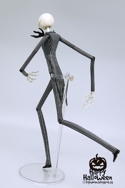
Primary sources for my character was basically looking at other people, their height, weight and overall look and structure of the body, though I also researched this in secondary sources too. For secondary sources for my character I was thinking of Alice Madness dark theme with my character not having a full face, giving off the creepy and dark theme that the Alice Madness game and illustration book has.  Also I wanted a Tim Burton and the slender man myth kind of style, tall, smooth, lanky, some parts out of proportion, strange, maybe some extra limbs etc. I would've improved the figure to be more defined and movable, along with maybe more colours as well as a pattern for the clothing. With Tim Burton's style, I was aiming for the kind of characters that were in the "Corpse Bride" and "Frankenweenie" as some of them had very slim tall figures though still in a way looking normal, overall having a strange but interesting look.


Evaluation


What did I do?

At the start of my work I had to think and generate ideas for a character along with a story I'd be able to tell about it. The first steps included simply drawing the character of how I wished for it to look like but also think if I'll be able to make it the way I want. In making a physical character I had to bend a think metal wire frame, hooking them together or being held together with masking tape which will support the figure to stand and move without going back to it's original form when colored plasticine is put over it. Once confirming I was to use this character I began to think how I could make a background set and objects by molding them out of paper, clay, cardboard, tissue paper or mod-rock that will link to it's story, maybe just hinting at the characters story or explaining it. Other objects that were include were made mainly out of mod-rock, a crooked looking chair, spiny looking tree with vines but no leaves and a small fireplace. I planned to make the background set into a dim attic like room, having the walls and floor as a stone or wooden paneling design. I decided to make the set to have a wooden cabin look, weaving cut piece of brown paper to look like a floor pattern, once finished I glued it to the floor base of the cardboard set.


Which techniques?

My techniques were first with metal/wire was to use the thin type, that way I could twist and hook it together to make a table enough wire frame structure.
When making clay models and then mod-rock models of my character, after making wire structures and then molding materials over it. My technique to mainly just cover up the wire frame first and then mold the materials over it into shape.
With the making of the box set, I took measurements with how big I wanted the box and have the parts of the box (base, sides, back) to fit together easily and stay stable together. My first attempt of this was scrapped due to some of the measurements being incorrect and slanted, though the second final attempt was also slightly slanted, it worked and fitted together better then the first attempt, though it did take away time.
I used paper and cardboard to make props to be alongside the character in the box, making and taking working measurements so other models could fit together.


Health & Safety

Plastic-protective goggles stopped any floating particles, dust, materials landing in or around our eyes that could cause long or short-term problems such as; irritation, allergic reactions and even blindness.
Kevlar cut resistant gloves protected our hands from receiving cuts and injuries that could also cause shot or long-term problems. 
The cutting boards protects surfaces where cutting with knives are being done, such as the tables within the work space. 
Metal rulers helped let us take measurements without damaging the ruler when using knives, its taller height compared to normal rulers helps prevent the risk of injury when using sharp objects with the ruler, whereas if we had used normal rulers it would've damaged them and increased the risk of causing injury to ourselves and inaccurate measurements from the ruler moving.
Having cased knives prevented the amount of cuts and injuries that would've happened, as well as giving the user of a cased knife having a stable and safe grip on it.
Hot glue was to be used maturely and with caution within a working space with enough room as it could have caused burns to other students or damaged materials and work.


Visual Language used

The main theme idea had to include dim colours such as grey, black, brown, white etc. As it was based in a theme of pollution, machines, factory's, having the look that was in the 1800's. Leaning objects and shadows would be included in the theme, representing confusion, depression, arrogance etc which relates to the story of the character involved.


How well did I work?

I think when I was trying to think up ideas for the theme of the box and character, I spent too much time on it since I was unsure on my ideas. Though when I finally got ideas down and written out I felt more confident in my work and as I built up towards it, but due to setbacks with taking up too much time on ideas and restarting the box, I was unable to completely finish.


What can I improve?

I would plan out my time for throughout my work, make up a schedule that would benefit me and my work. Also I would make more accurate measurements when making the box and the props that would go with it.


James Gillray

James Gillray was predicted to have been born on the 13th of August 1756 or 1757 in Chelsea, London, and died on the 1st of June 1815. 


Gillray had began life by learning letter engraving at which he quickly adapted to from his young age and upwards, though it didn't result in stable employment for his future. Once becoming a student in the 'Royal Academy of Arts', he supported himself by continuing with letter engraving and issuing a number of prints and 'caricatures' under fictional (fake) names, possibly to avoid criticism and negative feedback.


The 'Royal Academy of Arts' is an art institution in Burlington House on Piccadilly, London, established in 1768. It was privately funded and led by artists and architects with a purpose to promote the creation, enjoyment and appreciation of the arts through exhibitions, debates and education.


His 'caricatures' were almost all in etching, which was a traditional process of using strong acid to cut into parts of a metal surface to create a design. Some also with aquatint and a few using the 'stipple' technique.


He studied William Hogarth works in his early years, and when compared to James Gillray's work, there does seem to be some resemblances. 


'Paddy on Horseback' was one of Gillray's first official caricatures which appeared in 1779.


Miss Hannah Humphrey was James Gillray's publisher and print seller which he lived with most of the time during his entire period of fame, her shop being firstly at 227 Strand, then New Bond Street then in Old Bond Street and then finally in St James Street. James Gillray made a caricature of  the lack of courtesy on Bond Street with men taking up the footpath. The southern section of Bond Street named 'Old Bond Street', the longer northern section being 'New Bond Street'.

Thursday 22 January 2015

3D Art


Mod rock


For this part of the 3D work, I practiced with mod rock.
I wrapped it around different shaped bottles, small tubs, following the seam lines that were visible on them so I would be able to take off the hardened mod rock later on.


These are the results of the bottles. I used the bottles mainly for the practice of handling mod rock, finding out the different textures it can come out like; some came out bumpy rough, hard to get off the bottle, when another one came out as smooth and easy to slip off the bottle. The seam lines on the bottles resulted me in having three parts of a mod rock model, one of them being the bottom of a bottle, the other two being the main body of the bottle split into two.
The images below are the results of two bottles I used, on of them having the whole body of the bottle split in two with the bottom, the other having the bottom separate with one half of the bottles shape.


These are the results of using an ice-cream tub, having wrapped the outside of the tub. I wanted to use the shape of the small tub to make an abstract like model which would've had small twig-like and smooth shapes sticking out from it, also filling the empty spaces with more mod rock with the other objects inside it, or just fill it with a mix of tissue papers. The images show the tub I used and the mod rock model that came from it, which the tub can actually fit into or the model fitting back into the tub.


As well as using mod rock to take the shape of the tub and bottles, I made a tree structure out of wire-frame, taping them together to make the trunk and branches, ending them into shape before wrapping it in mod rock. Once it was dry and the mod rock had hardened I was able to slightly readjust some of the branches and then wrap it up with colored tissue paper so it would have a similar look and colour to an actual tree.

The health and safety for using mod rock was considered while I made my work.
If I was allergic to the materials used in the plaster I would've had to use gloves that were provided, as well as take more caution when working, but since I wasn't allergic didn't have to use the gloves, but used my bare hands instead which I would wash off later to clean off any leftover mod rock.
Ripping the mod rock when it's dry (unused) can cause it's dust to float around in the air and enter someone's lungs, causing difficulty to breathe short-term or even possible long-term for those who are allergic, depending how much is inhaled.
Mod rock was to be in the personal working area, not left lying about that could risk causing injury or damage other work.

Monday 19 January 2015


Thomas Rowland

Was born on the 13th of July, 1756 and died on the 21st of April, 1827 at the age of 70.

He was born in 'Old Jewry' in London, a one-way street being known for being the location of medieval Jewish community and seen as a ghetto.
Upon leaving his business school in 1772 he became a student at the Royal Academy and was then sent to Paris at the age of 16 to attend a drawing academy. He studied and practiced drawing the human figure before returning to the Royal Academy again and then based at the Somerset House.
He spent six years studying at the Royal Academy though spend a-third of his time in Paris practicing his art.
Most of his art was based off of politics, politicians, royal family, war, money etc.