My idea for my poster was to link it allergic reactions that can happen when using the materials in the studios.
I first did some research of what can cause the allergic reactions within a creative workspace, this included latex, some certain rubbers, dust, wood clippings/shavings, mod rock, food brought in etc. Also researching the safety equipment that can help prevent it including certain cloves, make, safety glasses, work coats etc.
Once getting my research down, writing and drawing some ideas in my sketchbook of what I would like my poster to look like I gathered the available equipment from the studios and took pictures of them. At first I did them on a white background but then I realized equipment that were also white or see-through like the gloves and masks which might not come out too clear when I'm developing them later, so I retook some photographs but in front of a darker background, using black paper.
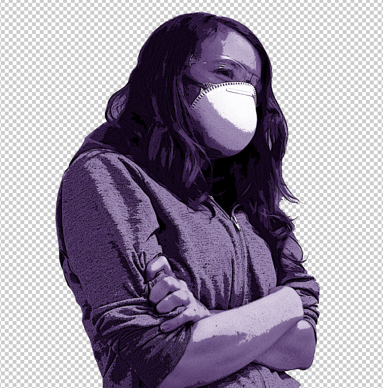
I took pictures of me wearing a mask, safety glasses/goggles and gloves, also some of a skeleton model wearing them that was in the studio.
 |
| I used the figure drawing skeleton as a model to use for the poster, in my mind I thought the image of a skeleton on a health and safetly/warning poster would be more effective and eye catching, espically for the subject. |
 |
| I decided to add myself into the poster to show what to wear relating to health and safety when working with equipment and certain materials. |
 |
| I then tried using a darker background, thinking that using a white background when wearing a white/see-through glove wouldn't cut out as easy, so just in case I used a dark background aswell. |
 |
| I used a latex white/see-through glove to use for the safety on a white background to prevent any unwanted colours showing up in the picture. |
I began developing the photographs, cutting them out from their backgrounds, highlighting them, improve their contrast and brightness and all used a poster and paint dab filter on them, making them stand out as I used the effect strongly on them.
Once happy with their effects I began to experiment with different colours on them to use on the poster, mainly the colours red, green and yellow.
Feeling more confident about my developed photographs I put them on a poster template with impact and helvetica font.


Coming to an end in my developing my photographs and design of the poster, I changed the posters background to black and the borderline, font and developed photographs to a bright yellow that helps it pop out and catch peoples attention.
No comments:
Post a Comment