 |
| I enjoy this comics relaxed, quick sketched style, it's not overally detailed but is done to right amount of minimal detail for the viewers to understand what things and objects they're seeing in the comic. Though the only thing I don't like about the comic is the writing, though it does look nice and seems to even fit the style of the comic illustrations, some viewers can't read or understand it very well, though I can just about make out what this style font of handwriting says. |
I have multiple kind of styles to choose from, messy, polished and clean looking, realistic and very animated/cartoon looking.
 |
| The way Clay Butler has drawn these illustrations has good visual effect to them, they're not overally detailed, though the shading and shapes of the characters in the comic adds to the effect, and it also reminds me of the comics that would be out into newspapers, it has that interesting and quick style look to it. |
 |
| These illustrations are quite simple as well, not alot of detail, just the creases in one of the characters jeans, the sofa and pillow. Also the light, calm-like colour palet fills in the spaces and gives it much better effect than if it was just black and white ilustrations. |
 |
| While still having the calm colour palet and simple and iconic character shapes of the illustration, it has a bit more detail and visual effect because of thickened lines, shadow and lighting effects using colour and not a lined or dot shading like other illustrations do. The style of this illustration has a simple yet eye catching and charming effect to it. |
 |
| These kind of illustrations can be appealing both to children and adults, children because of its cartoon style and adults for its humor and situations going on in the illustrations. Though the type of audiences the illustrator would be aiming for would've discussed and developed in the character development for the comic. |


The pipboy character, or mascot, from the Fallout series is a good example of a simple character illustration, it's simple design makes it easy to manipulate it into different poses and actions. While keeping it's iconic look and colours, making it incredibly and widely recognizable to many viewers.
 |
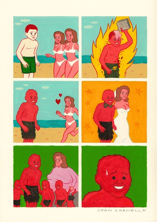
| Joan Cornella's style is very simple, not using much detail, lighting or shadows in most of his comics and illustrations, though I think the main thing that makes it interesting and overpowers the style is the humour and the illustrations in the comic/picture. |
 |
| The layout of most of his comics are mostly portrait with two cells on each row, it's short, quick, eye-catching and effective, it doesn't get boring with it being too long or over done, which is especially effective with modern audiences since their attention spans are getting shorter then they were, Joan Cornella takes advantage of this with his short comics. |
 |
| The humour of Joan's comics is the main and most powerful thing that stands out in his comics, though sometimes his humour can confuse viewers, that it's not funny because of what it's about, or because it's 'offensive', but people who get offended by it need to remember that it's a comic, it's entertainment, a joke that does appeal to quite a few people. |
 |
| Joan doesn't need to use 'time gaps' in his comics, a cell to say time has passed in it, he just does it with the simple illustrations he makes. He can successfully tell quite a story through just a few cells of illustrations and this makes it very clever and effective towards the reader. |
Joan Cornella is one of my favorite comic illustrators, his simple design being able to strongly visualize the situation in the comic, it's weird, confusing and sometimes dark humour. The colour palet varies with almost every comic strip he makes, making a lot of it quite unique each comic.
No comments:
Post a Comment