For the British Values 2nd poster, I had to use specific measurements and British flag.
My idea for the 2nd poster would be based around freedom, and I thought how I could show this through a minimal use of pictures for a lateral kind of poster about the British values. I thought about a bird sat on a body of water, standing, sitting, flying etc or the idea of breaking through a barrier, such as a wall, bars or a fence, the bird representing Britian, but for this I thought I should use a bird that actually, universally and automatically, symbolizes Britain or freedom.
 |
| A British flag design I was advised to use on my poster for the time-being, |
At first I thought of using a swan to symbolize Britain since they are large, powerful yet beautiful birds that are all protected, linking to the queen.
I thought how I would display it on the poster, it either being a swan by itself with a certain pose, it's wings open, spread or just closed wings either smooth or fluffed up.
 |
| I found this to be an interesting picture to use with it's spread out wings, giving it a beautiful pose and look to it. |
 |
| A swan siting on the water with a straight up pose with a simple shape that would be easy to cut out. |
 |
| A swan sitting on the water but with fluffed up, ruffled feathers. I thought this would be a good picture to use, but cutting out the swan figure would be difficult to do. |
 |
| I thought about using a hawk for the bird idea since hawks are quite common in Britain and could be used as a symbol for it. But after going through the options of the other birds such as the swan and robin, a hawk wouldn't be as suitiable or as effect. |
I thought over the swan option, but I was unsure how I could strongly present it while it automatically symbioses Britain or freedom. The swan would be more recognized as a British bird, but some might not recognize it as British linked since they aren't just in Britain, also they don't really represent freedom strongly.
The hawk option was quite a weak link after I thought over how it represents Britain or freedom, it's a bird not just based/from Britain and isn't recognized to represent freedom.
A good example of a bird representing freedom would be the golden eagle as it's universally recognized as being linked to freedom.
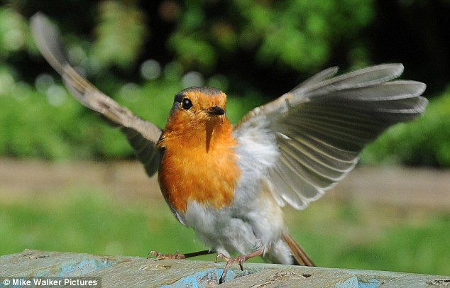
Dropping the swan and hawk bird idea, I moved onto the small bird of a robin, it's more recognized as a British bird and common, and people recognize them as wild, free and neutral birds.
 |
| I personally found Robin's to be cute birds which I thought would've been good to use for the British values poster, their colours of red bellies and face making them eye-catching. |
 |
| I thought of having the bird breaking through a barrier, so I looked for good pictures of a robin flying, with outstretched wings to use. |
 |
| Robins are very easy to recognise with their unique look of their red belly and head and overall small structure. |
I also thought that they're small structure would also represent Britain, being a small country but being quite unique in it's own way.
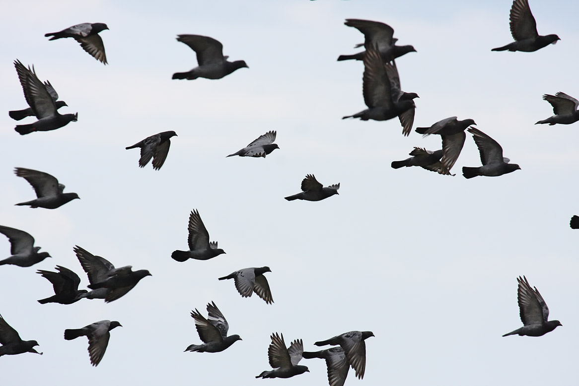
Still linking my idea to birds, I thought and tried out an idea of having a flock of birds instead of a single bird, using silhouettes of them.
Having a flock of birds would still represent freedom and fill more space on the poster, depending on the size of the flock and the birds.
I then started to work soon the barrier part of my idea, wanting to have something similar from my first attempts of my more full British posters, which has a poster with bird silhouettes breaking through the barrier of the line between the blue and white background, making a cool effect.


I had to sketch my own British flag to avoid using someone else's design online and avoid any copyright issues. I scanned them in and put them onto photoshop, putting them through different kinds of filters that makes them look more bold and sharp to standout on the poster since it would be quite small ad in the bottom corner of the poster. I chose the best design out of the flags and then placed it onto my poster in illustrator.
To now avoid using anything online due to copyright, we then had to use our own designs, this being a painting, a sketch, digital design or photograph.
The first idea I had when I had to make my ow design in any kind of media was origami, an origami paper bird with some bright colours to make it stand out, the colours being linked to Britain, so red white and blue, which would still link to the freedom concept I was doing. Though, I hadn't done origami very often and not for a while, so I had to use some online tutorials to learn how to make an origami bird or crane.
It took me a lot of attempts and trail and error, but eventually along with the help of a classmate, I was able to make a few origami that were neat and suitable enough to take pictures of.
Putting the British flag origami bird onto my poster, I saw that it stood out on both a white and black background. I then placed the words 'freedom', the British value I was basing my poster off of, in a small font next to the origami, in different places on the white and black background.
With the ink origami bird on my poster with both a white and black background versions, I placed small font onto the wing of the origami, but this time both in the same place on both versions because I thought it looked quite good to have the font at.
With the 2nd attempt of the origami bird on my poster, only on a white background this time, I placed the small text 'freedom' underneath the wing, which you cannot really see the outline of, which is one of the reasons why I put the text there, so it 'shapes' the wing in a way.
Overall though, I might change the white backgrounds to a light colour, like baby blue.
With the darker background versions, I noticed that the NNC logo and British Values text weren't standing out as much or as easy to spot before like on the white backgrounds, so I decided to change the font colour to a plain white.
Once finishing the origami parts of design, I started to work on a different design, a photograph of myself with arms outstretched, symbolizing 'freedom' since nothing is holding me back or down. I also did this because when I researched freedom, there were quite a few pictures of this pose.
With the dark silhouette in the white background, I decided to put the text underneath it, its font size being a bit bigger than the fonts I've used in the other poster designs.
The white silhouette I used with a light blue background has its freedom text inside the shape of the silhouette, across the chest like I tried out before with the dark silhouette.

Having a flock of birds would still represent freedom and fill more space on the poster, depending on the size of the flock and the birds.
 |
| I thought of have a flock of birds silhouettes and have a gradient yellow/orange background to replicate this image a bit, having a sunsetting or sunrising effect to the silhouettes of the flock of birds |
 |
| There were a lot of options with bird silhouettes, such as the kinds of birds the silhouettes would be of, which do actually show through in the silhouettes. |
I then started to work soon the barrier part of my idea, wanting to have something similar from my first attempts of my more full British posters, which has a poster with bird silhouettes breaking through the barrier of the line between the blue and white background, making a cool effect.
 |
| I found a image of a fence with a hole in it and I think it was suitable to use for my idea of a bird breaking through a barrier. |
 |
| I cutout a picture of a robin with outstretched wings to look like it was flying through the hole in the fence or had just came out from it. |
I altered the edges of the chain fence, giving it a fading out effect by using a low opacity eraser tool. Overall it looks like a design I could use, but I would have to avoid using any images from online, which the robin and chainlink are from. To resolve this I decided to use a pen tool to do the lines of the robin, which had quite a cool looking effect, then I


 |
| Some drawings I did of the British flag in my sketchbook that I would scan in to use on my poster. |
 |
| More attempts at the flag, changing the thickness and placement of some of the lines. |
 |
| Original scanned in flag design. |
 |
| Filtered, altered and improved flag design. |


I had to sketch my own British flag to avoid using someone else's design online and avoid any copyright issues. I scanned them in and put them onto photoshop, putting them through different kinds of filters that makes them look more bold and sharp to standout on the poster since it would be quite small ad in the bottom corner of the poster. I chose the best design out of the flags and then placed it onto my poster in illustrator.
To now avoid using anything online due to copyright, we then had to use our own designs, this being a painting, a sketch, digital design or photograph.
The first idea I had when I had to make my ow design in any kind of media was origami, an origami paper bird with some bright colours to make it stand out, the colours being linked to Britain, so red white and blue, which would still link to the freedom concept I was doing. Though, I hadn't done origami very often and not for a while, so I had to use some online tutorials to learn how to make an origami bird or crane.
 |
| My first successful origami bird, the shape being quite good, I kept this one unaltered. |
It took me a lot of attempts and trail and error, but eventually along with the help of a classmate, I was able to make a few origami that were neat and suitable enough to take pictures of.
 |
| I did a technique of splashing some watercolour onto a piece of paper with the colours and shape of the British flag before folding it into an origami bird. |
 |
| The result of the British flag paper design in an origami bird form turned out better than I expected, the shape being quite good and sturdy, and with the colours making it stand out. |
 |
| I took the photograph, cut it out into photoshop and put different kinds of effects and filters on it, mainly brightness and contrast effects, which I also used throughout my other photographs. |
 |
| I put a black background on it to see it the cutout was good enough to have on a dark background. It did and it's overall look stood out quite well from the background. |
 |
| The British flag origami bird on my poster with a white background, which stood out just as well on it like the one with the dark background. |
 |
| The British origami bird on my poster but instead on a black background |
Putting the British flag origami bird onto my poster, I saw that it stood out on both a white and black background. I then placed the words 'freedom', the British value I was basing my poster off of, in a small font next to the origami, in different places on the white and black background.
 |
| An origami bird that I put bright coloured inks on after it had been folded and made into its shape, using the British colours again, its shape also looking overall quite good. |
 |
| I did the usual of cutting out the photograph in photoshop ad then using the main effects ad filters of brightness and contrast. |
 |
| I put the filtered origami bird onto a dark background and it also stood out well. |
 |
| The ink origami bird on my poster in illustrator with a white background. |
 |
| The ink origami bird on my poster with a dark background. |
With the ink origami bird on my poster with both a white and black background versions, I placed small font onto the wing of the origami, but this time both in the same place on both versions because I thought it looked quite good to have the font at.
 |
| A second attempt at putting ink onto an origami bird, though the origami shape didn't turn out as good as the others, I still decided to use it. |
 |
| The origami photo cut out and put through filters to make it brighter and stand out. |
 |
| I also put the filtered origami onto a dark background, but this time, the cutout was showing to not be that good and have a sharp white outline, so I didn't save it with my poster on a dark background. |
 |
| The 2nd attempt origami bird on my poster with a white background. |
With the 2nd attempt of the origami bird on my poster, only on a white background this time, I placed the small text 'freedom' underneath the wing, which you cannot really see the outline of, which is one of the reasons why I put the text there, so it 'shapes' the wing in a way.
Overall though, I might change the white backgrounds to a light colour, like baby blue.
With the darker background versions, I noticed that the NNC logo and British Values text weren't standing out as much or as easy to spot before like on the white backgrounds, so I decided to change the font colour to a plain white.
 |
| The NNC logo before I changed it's dark grey to a plain white. |
 |
| The NNC logo after changing it to a plain white, much better to have with a dark background. |
 |
| The British Values text in a plain white colour. |
 |
| A photograph a classmate took for me of me walking away from the camera with arms outstretched. |
Once finishing the origami parts of design, I started to work on a different design, a photograph of myself with arms outstretched, symbolizing 'freedom' since nothing is holding me back or down. I also did this because when I researched freedom, there were quite a few pictures of this pose.
 |
| A cutout I did of the photograph in photoshop and then filled it with the bucket tool with black, making it look like a silhouette. |
 |
| With the filled in cutout now looking like a sillouete, I tried putting a small freedom font of text inside it, across the chest of it. |
 |
| The sillouette o my poster with a white background. |
 |
| I then changed the silhouette colour to white using the bucket tool with a light blue background. |
The white silhouette I used with a light blue background has its freedom text inside the shape of the silhouette, across the chest like I tried out before with the dark silhouette.

No comments:
Post a Comment