At first, I just did basic research on the history of Worksop:
- How it looked
- Events that happened
- Traditions
- Buildings
- Celebrities
- Landmarks
- etc.
I found some old photographs and illustrations of Worksop, some photographs in places of Worksop that I recognize today.Though, as much as I found these photos interesting, I did't know how I would use them into a postbox design, and if I did, I don't think people would recognize it as something linked to Worksop.
 |
| An illustration of a manor that was built in the Worksop area. |
 |
| An old photograph I found under the Worksop name, with an old camera image quality, crowds of people as what seems to be police or militants riding on horses down the street. |
Moving on from the idea of old illustrations and photographs of Worksop, I decided to try and make a design linked to modern Worksop with it's buildings, transport and structures within the town.
I came across alot of good examples I could use and work with to put into a design, including the cinema, the old sewage pumping building, bus station, the canal going through Worksop, castle hill, trains and train station, and sculptures.
 |
| Savoy cinema within the town stands out quite a bit, its new, modern -like design standing out from the other buildings its next to including the council. pubs and hotels. |
| The old sewage pumping building stands on its own in quite a open field area, having been unused and abandoned for quite some time, though sticks out in the area. |
 |
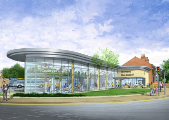
| The new remodeled Worksop bus station shows how more modern, slick and interesting designs are moving into Worksop, also sticking out from the other buildings around it. |
 |
| The canal running through Worksop which can be spotted in multiple areas in Worksop with wildlife. |
 |
| Castle Hill, some history of Worksop, a hill that used to have a small castle structure on top of it, though the castle isn't there today, the hill is still accessible as a park area. |
Once I had gotten the objects, places, things etc. I was going to use in the designs, I the had to decide what kind of style it would have. This would include:
- The colours involved
- The shapes
- Text font and size
- Added designs such as doodles
- Abstract or an illustration
- etc.
I thought how I wanted the design to stand out from afar and close up, to catch peoples attention, to make it something they would enjoy looking at and share an interest with the people within Worksop if it was to be put of a postbox.
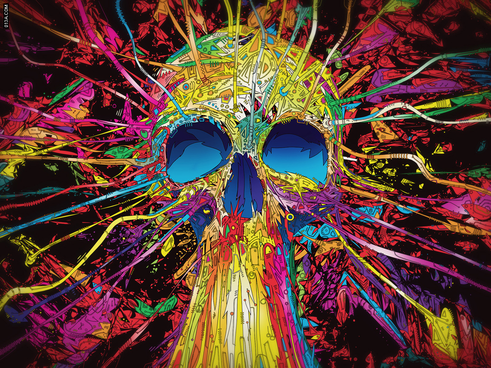
Then I settled on psychedelic designs that were quite common in the 70's and at festivals and some music videos and albums, since they're so bright, colourful, eye-catching and interesting to look at.
 |
| A design that has multiple use of colours, though not too bright it's still eye-catching and able to make out the shapes and objects within the design. |
 |
| A poster promoting a place with bright, neon like colours, a pattern of repeating design and psychedelic colours. |
 |
| A very detailed colourful design, though not psychedelic it's still quite an eye-catching design, a very well done one, with a lot going on in it. |
 |
| A very basic yet cool looking and effective design, the shapes involved, the font of the text and colour used, altogether,making an image of a broken pill which makes another image, a heart. |
 |
| A very distinguishable design of being psychedelic with its bright colours and patters, along with the use of drug signs and symbols, which are linked to pshedelic art often. |
 |
| A quick practice pen sketch of my style of drawing trying to mix with a psychedelic style, and next to it on the right a quick attempt at a style of not taking my pen off the paper. |
Having done research into Worksop and the style I was to make the design in, being psychedelic, I began to start practicing my own kind of psychedelic styles and designs.
Listing down the main things to include, I did some quick pen skecthes as practice which would help be move forward and create better ideas. First doing detailed line work, more my style, then moving out of my usual drawing style and more onto the psychedelic style, then quickly trying a technique where I don't take my pen off the paper. I did do multiple tries with the not taking pen off the paper technique, but I felt like I wouldn't be able to effectivly put this into a design.
 |
| My practice sketches of not lifting my pen off the paper with different pen colours, giving a slight psychedelic affect. |


No comments:
Post a Comment