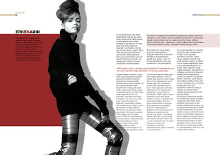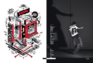
 I researched the cover designs of magazines, leaflets and booklets to inspire, reference and give me an idea of what my own cover design should and shouldn't be like. I've used these images as examples;
These first two images are neat and organised, but just too boring and blank, doesn't really cath a readers attention with how the colours have been used and all the empty space around the text, a bad example of a cover.


These images however do catch a readers eye, they caught mine. Some of them use techniques that have an a image spread out across the page or cover, it makes the image and the text stand out a lot more and possibly more interesting to read. They all use a good colour palet, not using to many that it becomes too busy and confusing that interest is lost in it, or not enough colours so they would be seen as boring and make people assume it won't be interesting it fun to read, but instead maybe serious. These are good examples of covers.
These pages are also good examples, they're different, they have they're own kind of style, depending on what subject it might be based on in the book, magazine etc. they're in. Some using real life photography and others using illustrations.


No comments:
Post a Comment