My automatic illustration included quite a lot of different colours and shapes, once I transferred it onto the mac I developed it and added different filters and effects to my painting, including:
- Crosshatch
- Angled strokes
- Splatter
- Sprayed strokes
- Glass
- Cutout
- Craquelure
![](https://blogger.googleusercontent.com/img/b/R29vZ2xl/AVvXsEgMpMqrv7O-hqaUGPiFgPrl_UJx2Tt-hriNq6qG17LqvcxnKwoYxC9eZDcAHZKnNBLMyEh1oUO1aWkH8wE3r553Eiz7X05GKmItZynvNJ2pOeWQNF_oiC-rh1Nzs8tuGXBS7Bmkw3-N-zQd/s200/Screen+Shot+2015-12-18+at+10.08.52.png)
![](https://blogger.googleusercontent.com/img/b/R29vZ2xl/AVvXsEiTbUYZXL9DCSBshxkrD1z7dOhTgLUFlS1AhEZate4ux4WQf8xOW3vla7cLRMU_eHXEB41YUY8jSjA0_1MTIkWbxN8Bf3ASS4DYYD3xtis4corZUD-9BOK4w7vPxBMwTg4nhPkJ-9XbIEAe/s200/Screen+Shot+2015-12-18+at+09.36.19.png)
![](https://blogger.googleusercontent.com/img/b/R29vZ2xl/AVvXsEgWkqvrklp4W0MlzUVhz5tKxmldeev6GyNUCbdFRctwM933qyIu53zgIHOUo6-o97kqQkFs7hL-jRkmdnfn0otxhg_YJTpvR9SvmNVLlj2t1TGmix7T21ipf-YCaUHONdzQkPk2gquKjv5b/s200/Screen+Shot+2015-12-18+at+09.35.15.png)
![](https://blogger.googleusercontent.com/img/b/R29vZ2xl/AVvXsEip2aGYO5cOMtKDQelgQ9kKTE1J1VgmLDlMFi2xpIex_hX0RjBpnbPumURZKTeaApBBXePOYABp4jEQtxMF4_Lk1KvpdyE6w8lPD6x29fiUC-vKmrSkgaNVYKzKYyD49ODbXwbVX0bABS91/s400/Screen+Shot+2016-01-08+at+10.59.37.png)
![](https://blogger.googleusercontent.com/img/b/R29vZ2xl/AVvXsEgiqktiEZNFpvPmy-PSypFKwnYKiANU8OR5-qYhISEciesykmUy1Add2200ZqVfbwX_xnXDGpnGm3Ulc3_FoxjjIXx3xVBQsjyj_WcxYoe9hmC8bZsJFOe8gb7dyfWl5UQn7WO9uTD4uUk_/s200/Screen+Shot+2015-12-18+at+11.26.26.png)
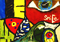
After trying put different filters and settling on one that makes it look brighter with better contrast, I began to develop it in different ways using the smudge tool, duplicating it and flipping it around.
The smudge effects looked interesting and eye catching but I also think it looked a bit messy and childish, so I tried flipping it so it matching or reflecting sides instead, which resulted in looking a bit better. I placed the text in the shapes and colours of the picture which proved difficult with the shapes and colours of it. Though in the end I was able to settle on a design I was happy with, the text and information fitting into the image on the back and front of the cover.
No comments:
Post a Comment