To design and develop my 'Learner Survival Guide' I had to think of how I would present it, what images I would use, would I draw, photograph or paint the image for the cover etc. I wanted to have a 'Survival' theme to it, linked to wilderness survival. I sketched out my ideas and thought of either taking pictures of all the college equipment I can find and photoshopping it into a pile or with a skeleton in the wilderness, between trees, bushes, grass etc. I decided to take some photographs inside and outside the college, also using some props and equipment including the macs, keyboard, mouse and skeleton.


Then I went on to use references that link to my idea, and pictures I would like to use if they weren't copyrighted. The images I used and changed in saturation, changed gamma and filtered were survival and adventure linked, so mainly images of forests from tv series like Adventure Time, Gravity Falls and Over the garden Wall.


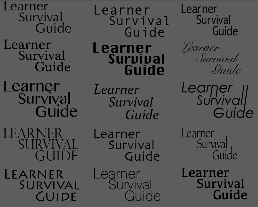
After developing and practicing with filters on the more forest and survival linked images, I began to do the same kind of development with real photographs with classrooms and students, as well as adding in some text that I altered individually with colour and shape and picked from a range of different fonts I compared together, judging which of the fonts would fit the student survival guide theme.


As I was settling in with my idea of the survival guide, I transferred my photographs onto the mac to develop them. I developed most of them as I wanted to see how they would turn out once filtered and corrected with text, college logo and information.


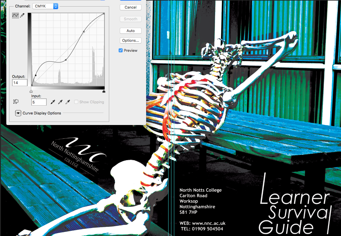

As I began to narrow down my choice of photographs I was going to use for the cover, I developed the boarders, colours and text that would also be on the cover and to give it a more professional look. I desaturated the colour from the mac photograph and put the skeleton photographs on the screen and placing boarders on the bottom and left side of the guide. I was unsure what colour to use for the boarders and thinking if I should use the college colour, red, or different ones like blue or green, but I was advised to use something apart from red since it was quite overused.


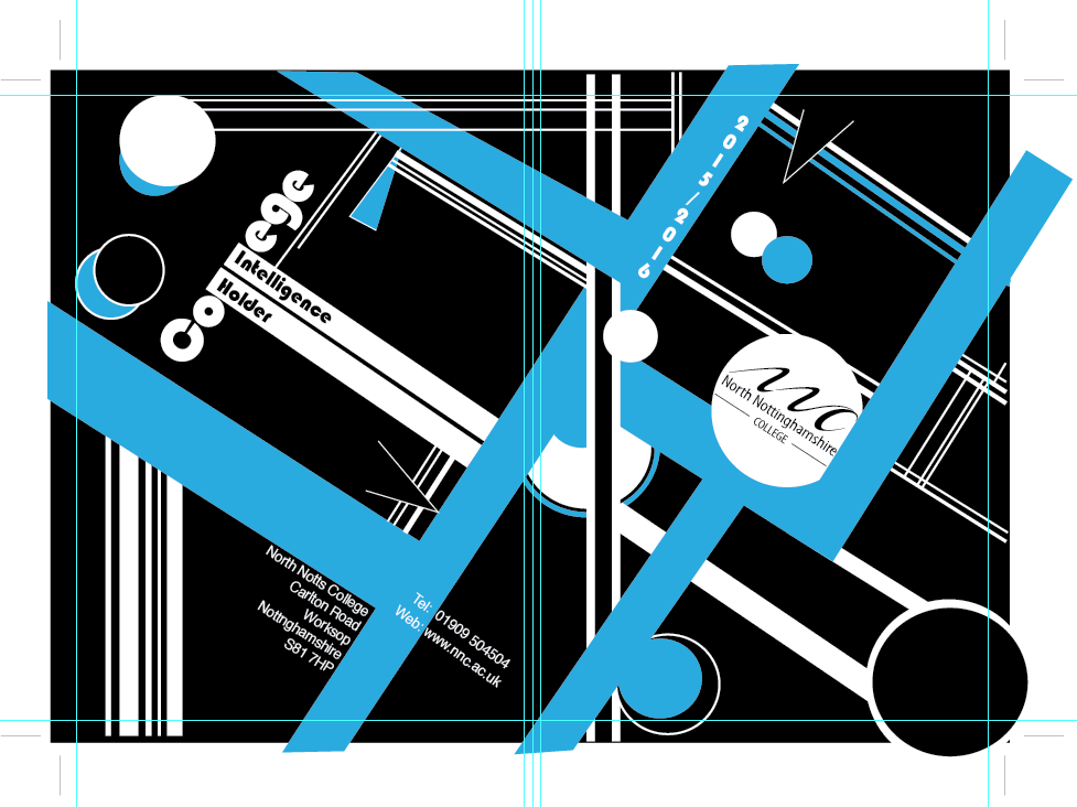
These are my 4 final designs I narrowed down to and printed out for the Learner Survival Guide cover.
My main choices where my bauhaus designs with different colour pallets, which I think that stand out nicely, mostly including the colours red, white or blue with multiple thick and thin lines making up paths and patterns across the cover design, the information of the college address, number and logo are blended into the design.
The abstract painting cover design I did, which is also an automatic painting, stands out with the bright colours I used and enhanced in it, making it stand out.
No comments:
Post a Comment